Overview RNB Renaissance
RNB Renaissance is an independent media platform covering French-language R&B: podcasts, interviews, seasonal playlists, editorial. It started with a delicate serif wordmark built around a golden-age idea. The mark looked precious, it broke down at small sizes, and it pulled the brand toward nostalgia at the exact moment the scene was doing the opposite.
I rebuilt the identity from the name up, around one idea. Renaissance means rebirth, not revival. Everything in the system encodes that, and everything scales across the surfaces a media platform actually ships every week. The numbers below are the audience response over the season that followed.
Details
role
Brand designer, freelance. Sole designer, end to end.
client
RNB Renaissance.
year
2024.
deliverables
Logo system, color system, type system, illustration set, applications (social, playlists, podcasts, merch), brand guidelines.
Problem Selling a memory
The old logo was a hand-drawn serif wordmark with a tagline, le nouvel âge d'or du RNB francophone(the new golden age of French R&B). Three issues, all structural.
A platform that publishes weekly needs an identity that produces work, not one that has to be decorated onto each new thing.
- 01
It read backward.
The wordmark felt nostalgic and ornamental. The scene it documents is young, fast, and diverse. The identity was selling a memory, not a movement.
- 02
It didn’t scale.
The script collapsed at small sizes, a 40px avatar, a podcast thumbnail, a merch print. Anything below a hero placement lost the name.
- 03
It was a fixed mark, not a system.
There was nothing behind the logo. Every new format, a playlist cover, a podcast title card, a tote, became a one-off, redrawn each time.
Approach
Start from the word, then build a system that can carry the idea everywhere, instead of one logo applied on top of things.
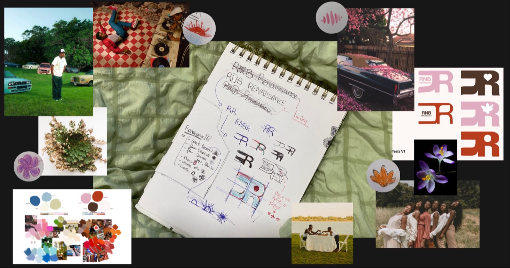
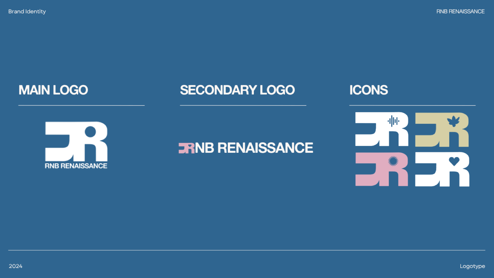
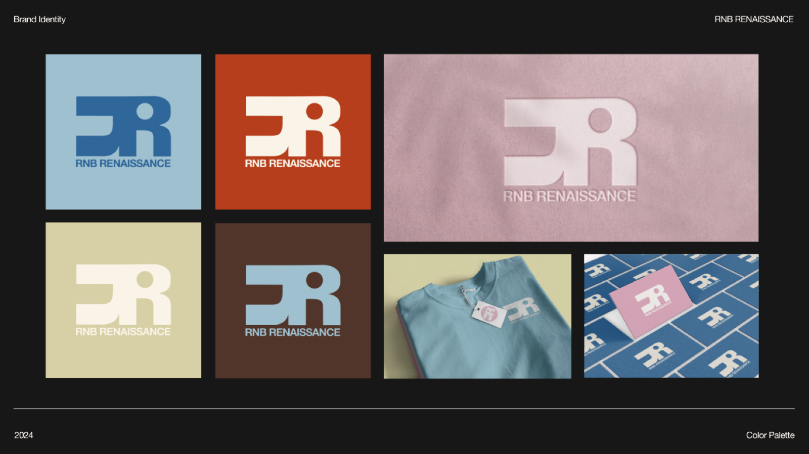
1. A monogram that encodes the idea
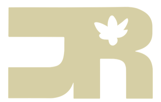
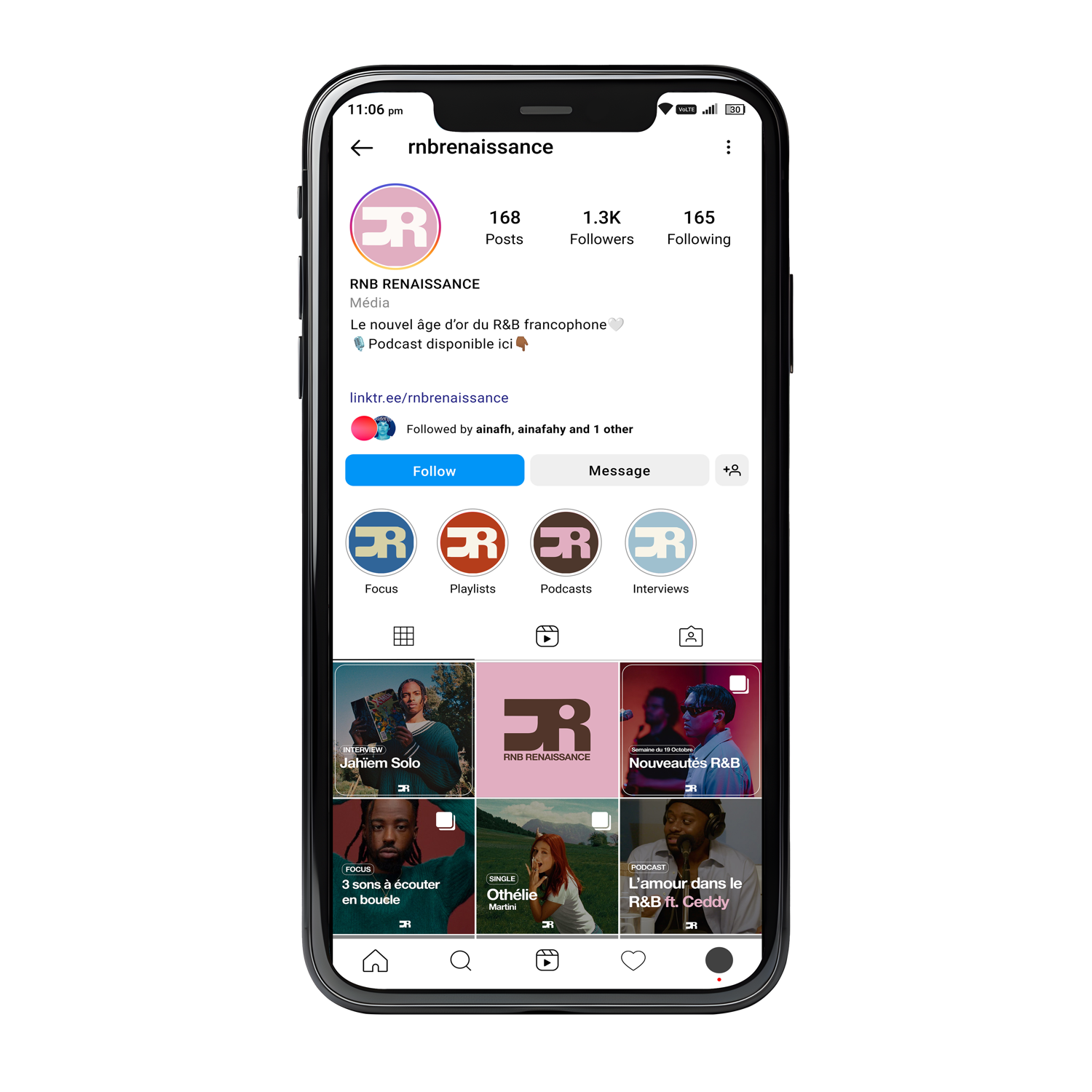
Two R's, one turned into the other, so the mark reads as a cycle rather than a pair. Unity and renewal sit in the letterforms themselves, not in a tagline that has to explain them. It works three ways, a full lockup for primary use, a wordmark alone as secondary, and a standalone icon that holds at avatar size. “It disappears when small” is solved at the geometry level.
2. An icon set, not a frozen logo
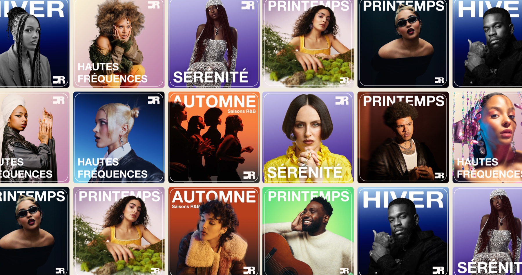
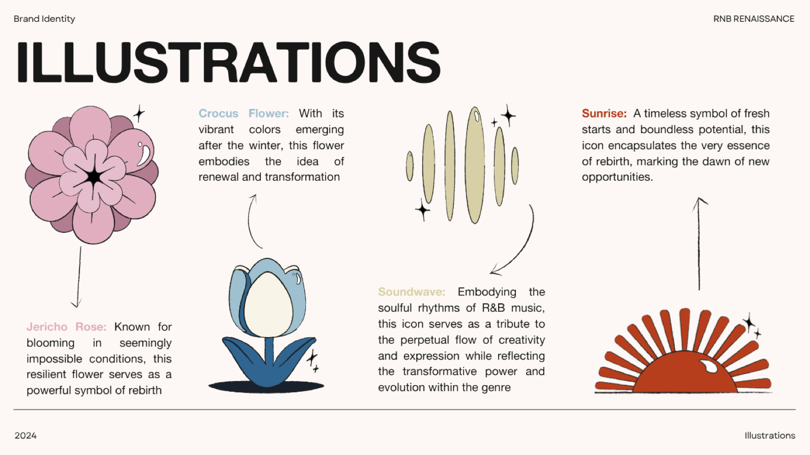
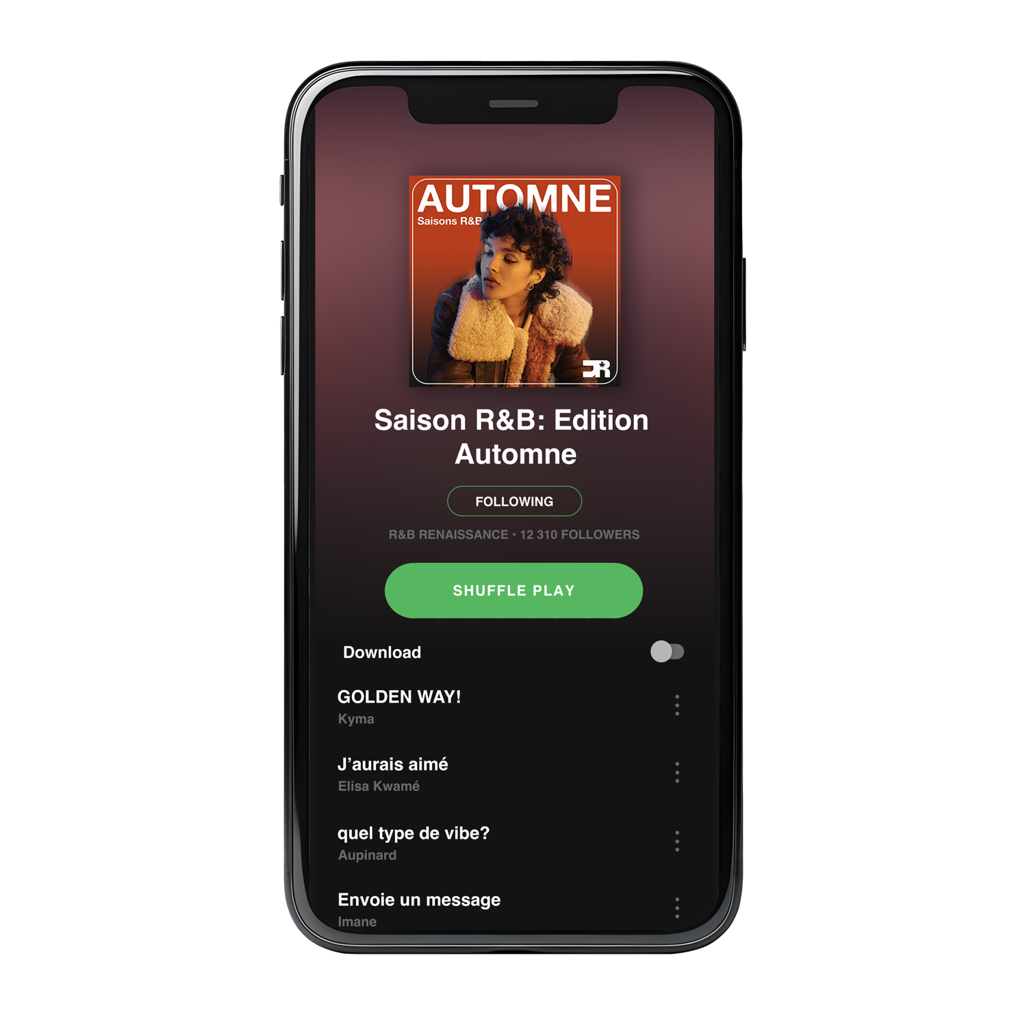
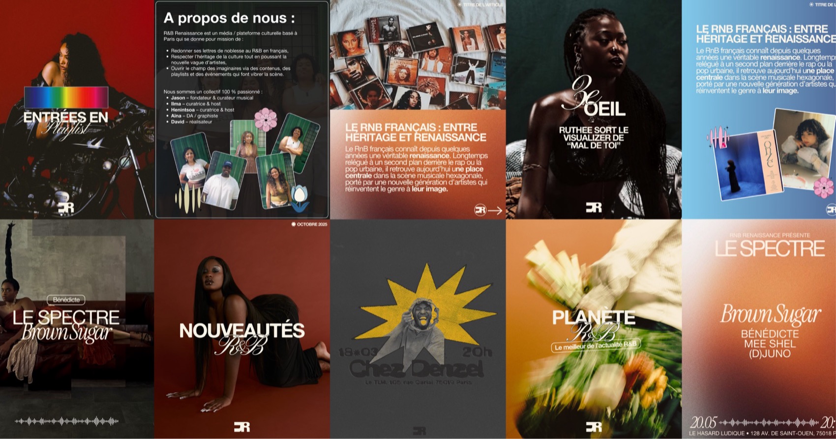
The monogram holds a slot for a symbolic element: a soundwave for the music, a sunrise for a fresh start, a crocus and a Jericho rose (two flowers that bloom from almost nothing, literal rebirth), a heart for the romance the genre runs on. Same mark, different meaning per context. The logo became a container, the reason the identity survives across podcasts, playlists, and merch without being redrawn for each one.
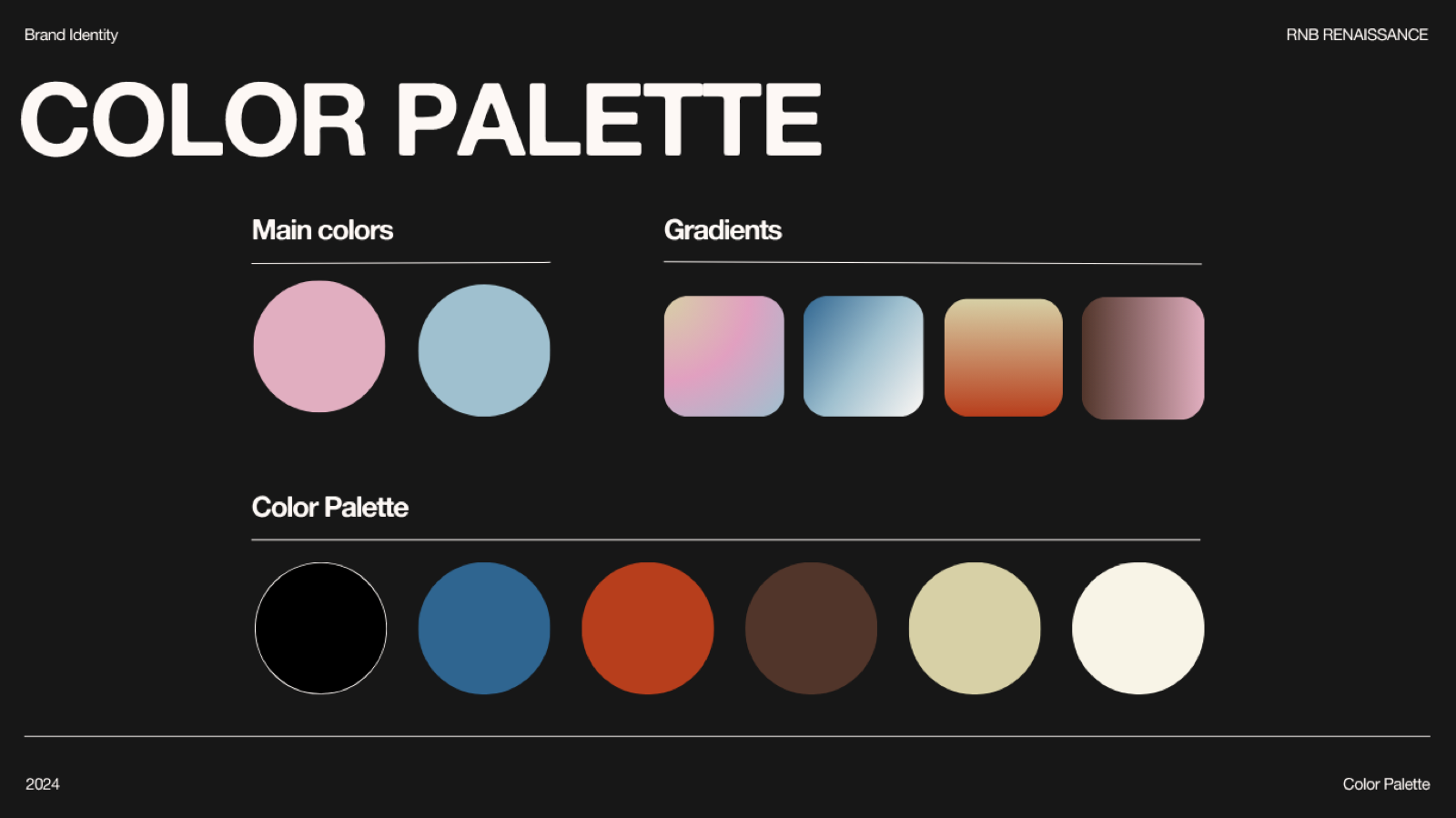
3. A palette with roles, not just colors
A black and cream base anchors everything. Soft pink and tranquil blue lead. Deep blue, beige, brown, and a fiery orange are accents for contrast. Gradients handle editorial and seasonal work. The point was range: the same brand can feel calm on a Sérénité playlist and loud on a podcast title card without breaking, because each color has a job rather than a vibe.
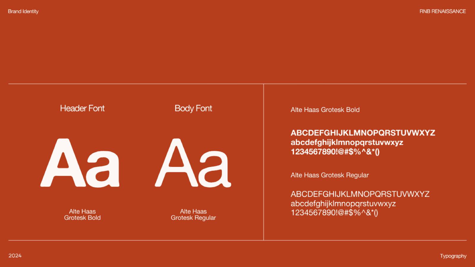
4. Type as the workhorse
I swapped the serif for Alte Haas Grotesk, rounded, plain, reads cleanly from a merch print to a phone screen. Bold for headers, regular for body. Boring on purpose: the personality lives in the mark and the color, so the text can stay out of the way and do its job everywhere.
5. Applications as the real test
A system is only as good as its worst weekly use. I designed the recurring formats directly, so the rules came out of real production, not a guidelines document.
- Playlists, on a grid, organized by season and mood, so each release is recognizable and quick to produce.
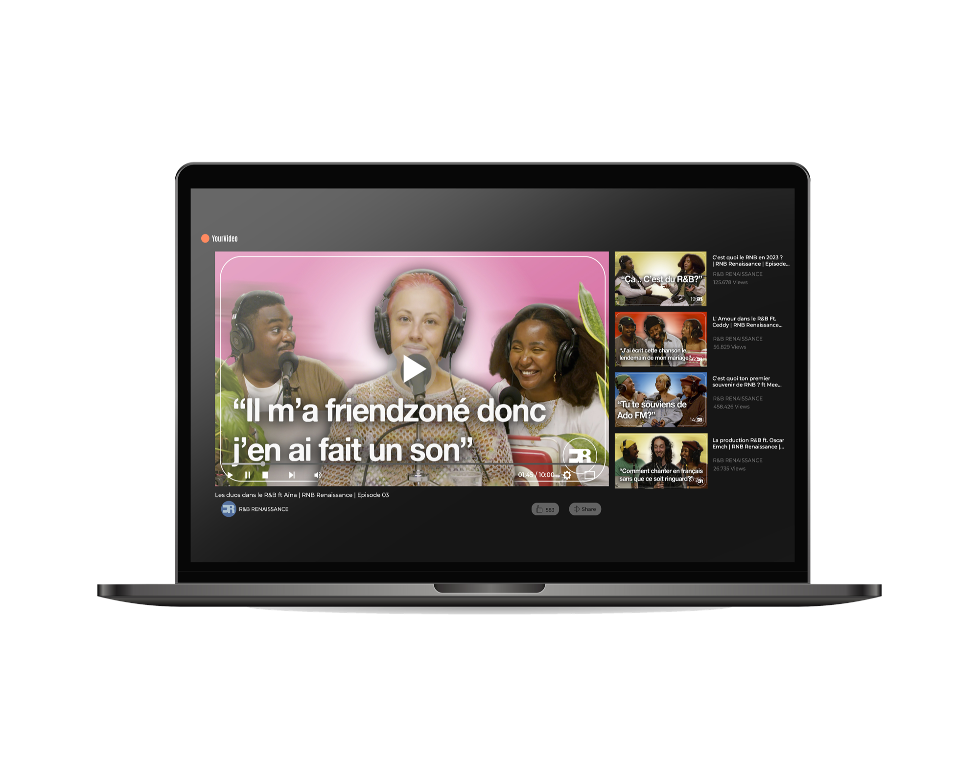
- Podcast cards, with a consistent quote-led layout, the monogram anchored in the same place every time.
- Merch, where the monogram carries the whole thing alone, no wordmark needed.
- Social, built from the same components, so the feed stays coherent across post types.
Before and after
- Old
- One precious mark, redrawn for every use, nostalgic.
- New
- A flexible system that produces work and reads as a scene in motion.
Impact
In the five months after launch, across the platform's main channels:
First-month movement was already there (+35% Instagram followers, +25% YouTube subscribers, +40% views), and it compounded over the season as the system shipped consistently across formats.
The numbers track audience response, not the rebrand in isolation. What the identity did was make the platform legible and repeatable: every podcast, playlist, and post now reads as one brand, which is what let the content compound instead of resetting each week. It also made the platform easier to recognize in the scene, which helped on the editorial side (more artist interviews and features).