Overview OGUR
OGUR is a continuous surveillance system for pharma competitive intelligence. Specialist agents read the open biomedical web around the clock and turn it into a stream of weighted, source-anchored signals. I came in as the founding designer to build the product layer on top of that engine: the information architecture, the interfaces, and the design system that make a flood of dense data something a person can read, trust, and act on.
Details
surface
Web app
role
Founding designer, solo. Product strategy, service design, UX/UI, design system.
team
Khalil Ouardini (founder & engineer).
stack
Figma, then React, TypeScript and Tailwind. I ship in the same codebase as the engineers.
In three lines
Problem. Competitive intelligence in pharma lives across dozens of sources and the tools produce static, late, one-drug-at-a-time snapshots. The engine could see everything. A person still couldn't.
Approach. I designed the product layer that turns a live signal engine into a workspace an analyst trusts: a readable stream, an asset page that consolidates everything known about a drug, inline provenance on every claim, and an AI layer that answers with citations.
Result. One design system carrying every view, an asset page that answers “what is this and what changed” in a single scan, and an AI grounded in traceable signals. Shipped, in stealth, in early design-partner conversations with European mid-cap pharma.
Context surveillance, not research
Pharma's biggest calls get made on a static picture of a moving field. A competitor moves, an analyst is asked, and the answer arrives weeks later as a deck that is already out of date. OGUR's bet is that competitive intelligence is a surveillance problem, not a research one: watch the field continuously, weight the weak signals, route them against the questions a team has already declared, and surface the anomaly before it is obvious.
When I joined there was a working engine and nothing else. Code and data, no product, no design. My job was to turn that capability into something an analyst would open every morning.
Who it's for
I mapped three users before touching a screen, because the same surface has to serve a daily power user and an occasional skimmer.
CI analyst
The power user. Scans every source each morning, flags the two or three material changes out of two hundred, and writes the briefings strategy and BD act on. Back many times a day, and has to defend every claim.
Business
development lead
Needs fast asset snapshots: is this drug differentiated, who else is chasing this target, what is the trial momentum. Checks in, gets the answer, leaves.
Strategy director
Wants the conclusion, not the feed. Confidence, provenance, and “so what”. Rarely clicks into a single trial.
What I found
I ran a full audit of the product against these users, written as user stories with the gaps called out. Three findings shaped everything after.
- 01
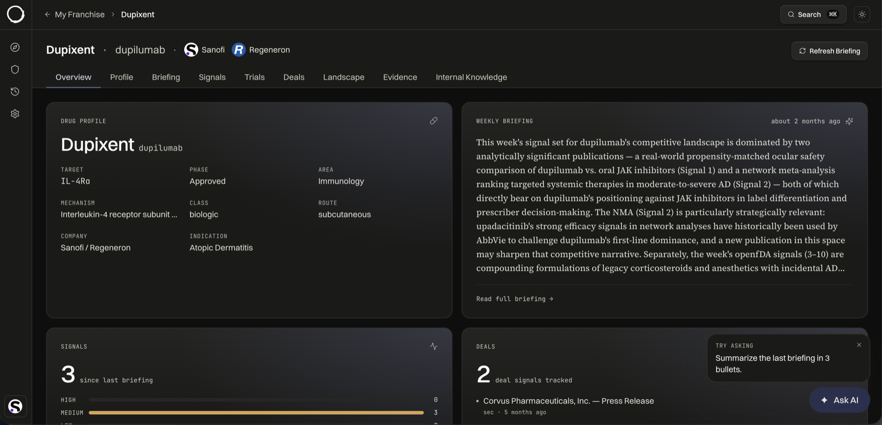
The most important view was the hardest to reach.
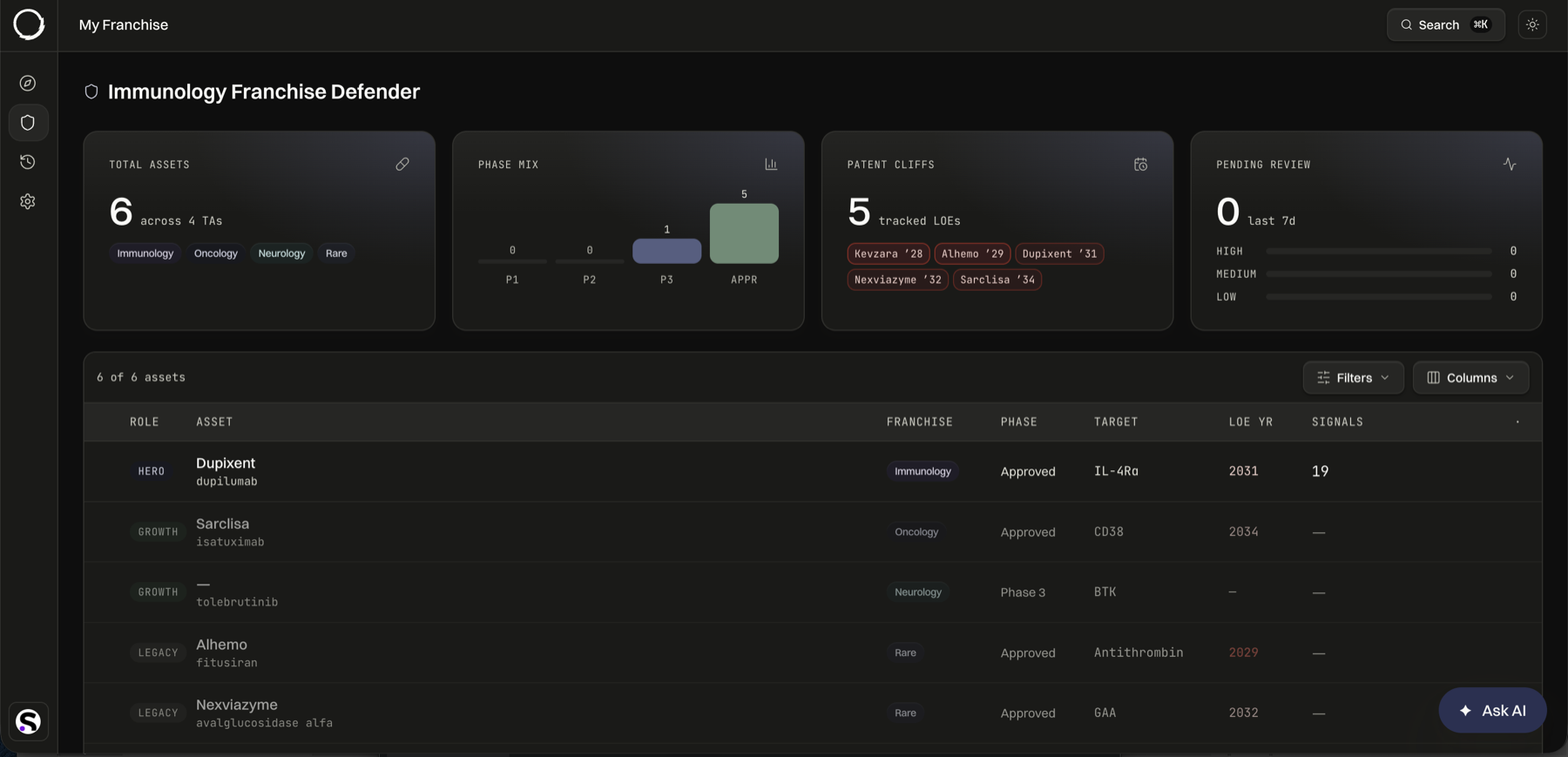
The asset page holds everything known about a drug, yet you arrived at it through a portfolio list, then a franchise list, then a click. Three steps to the one screen analysts live in.
- 02
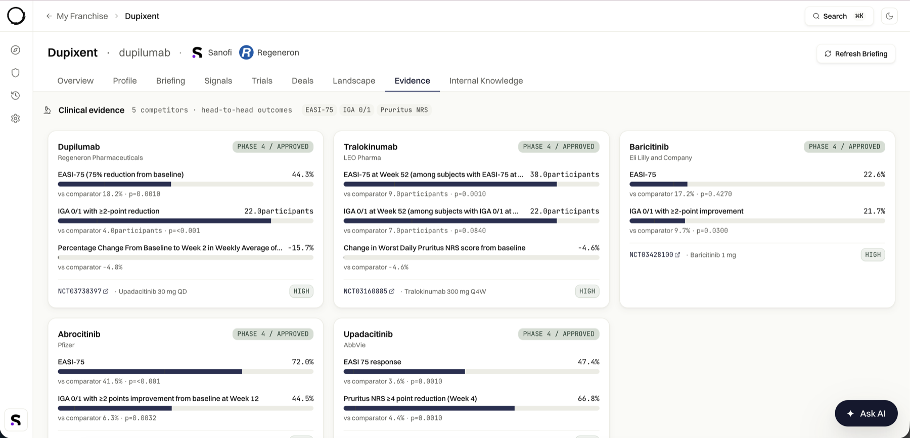
A claim an analyst can't trace is a claim they can't use.
These users defend their work to directors. Provenance is not a detail to add later. It is the difference between a usable tool and a nice demo.
- 03
Depth and speed were fighting.
Everything known about a drug sat behind seven flat tabs, so building a picture meant opening all of them. The power user wanted depth, the skimmer wanted the gist, and the page served neither well.
Design
1. A landing that answers “what changed”
The product opened on a raw portfolio list. I replaced it with a surface that leads with what an analyst actually returns for: the latest high-severity signals, their watchlist, recent briefings, and a prompt into the AI. The list still exists, but it stopped being the front door. The most important things are now the first things.
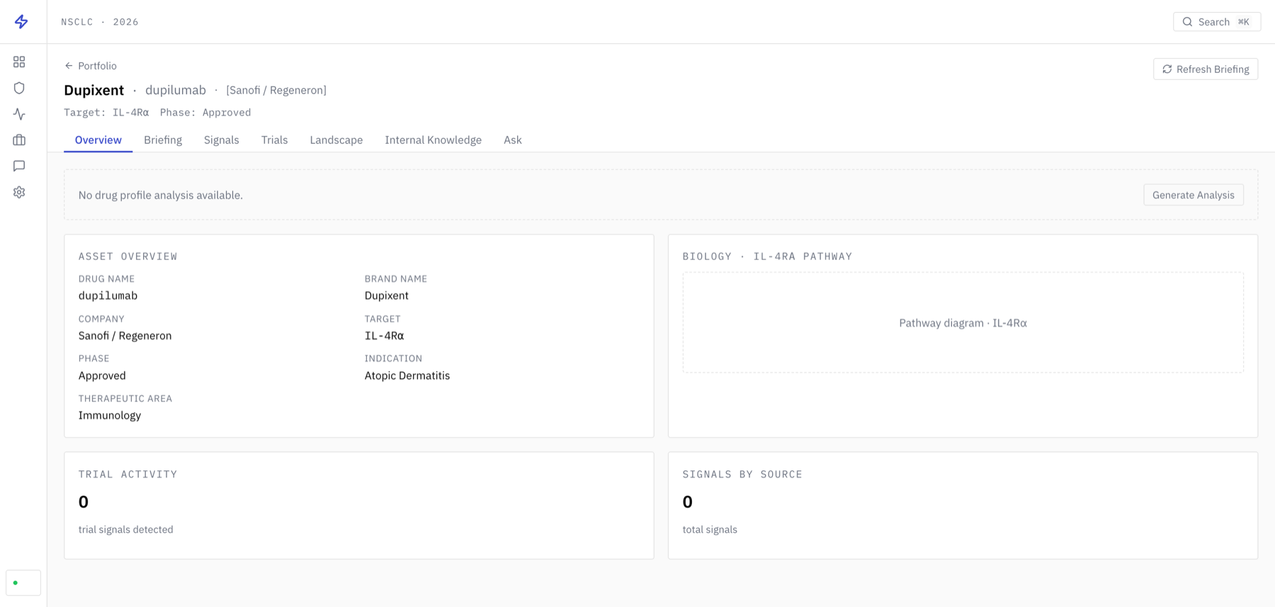
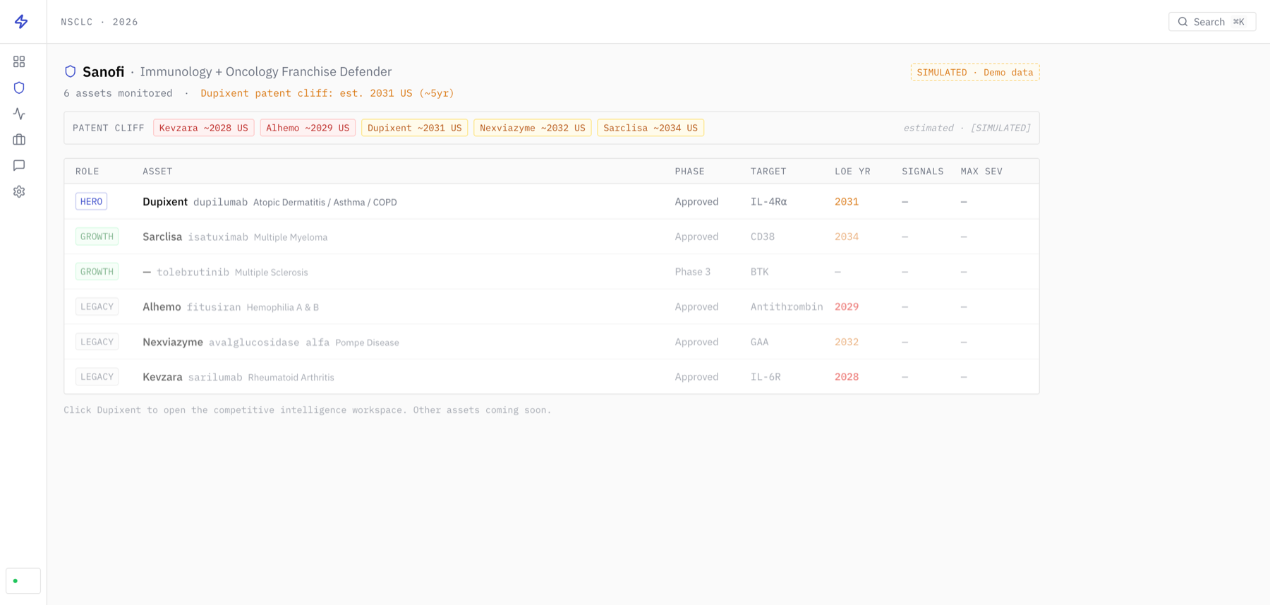 beforeafter
2. The asset page
The hardest screen, and the centre of the product. It holds everything known about a single drug, pulled from every source. I built an Overview that answers the question at a glance: drug profile, the week's briefing, the latest signals ranked by severity, the active deals, all on one scan. The depth then lives in tabs along the lines analysts already think in. Every number carries its source and date inline. Every named entity is a link, so analysts move sideways through the field instead of back to a list. A command palette covers the whole thing for keyboard workers.
 beforeafter
3. The live signal stream
The pulse of the field. Every observation lands as one line: time, what happened, the source it came from, and a weight saying how much it matters. Source and routing are part of the line, not buried behind a click, so an analyst can triage hundreds of entries by eye and trust the handful they keep.
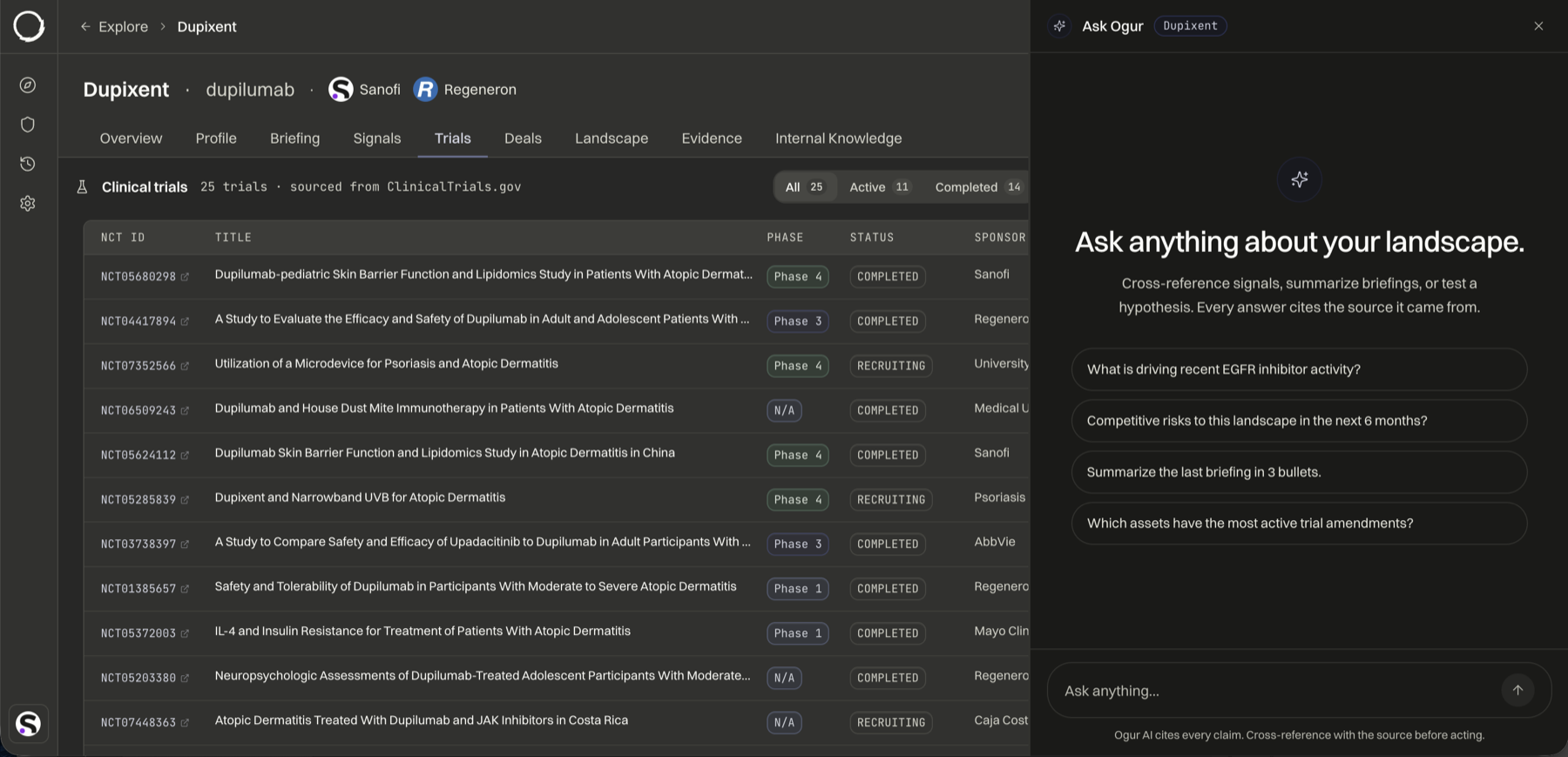
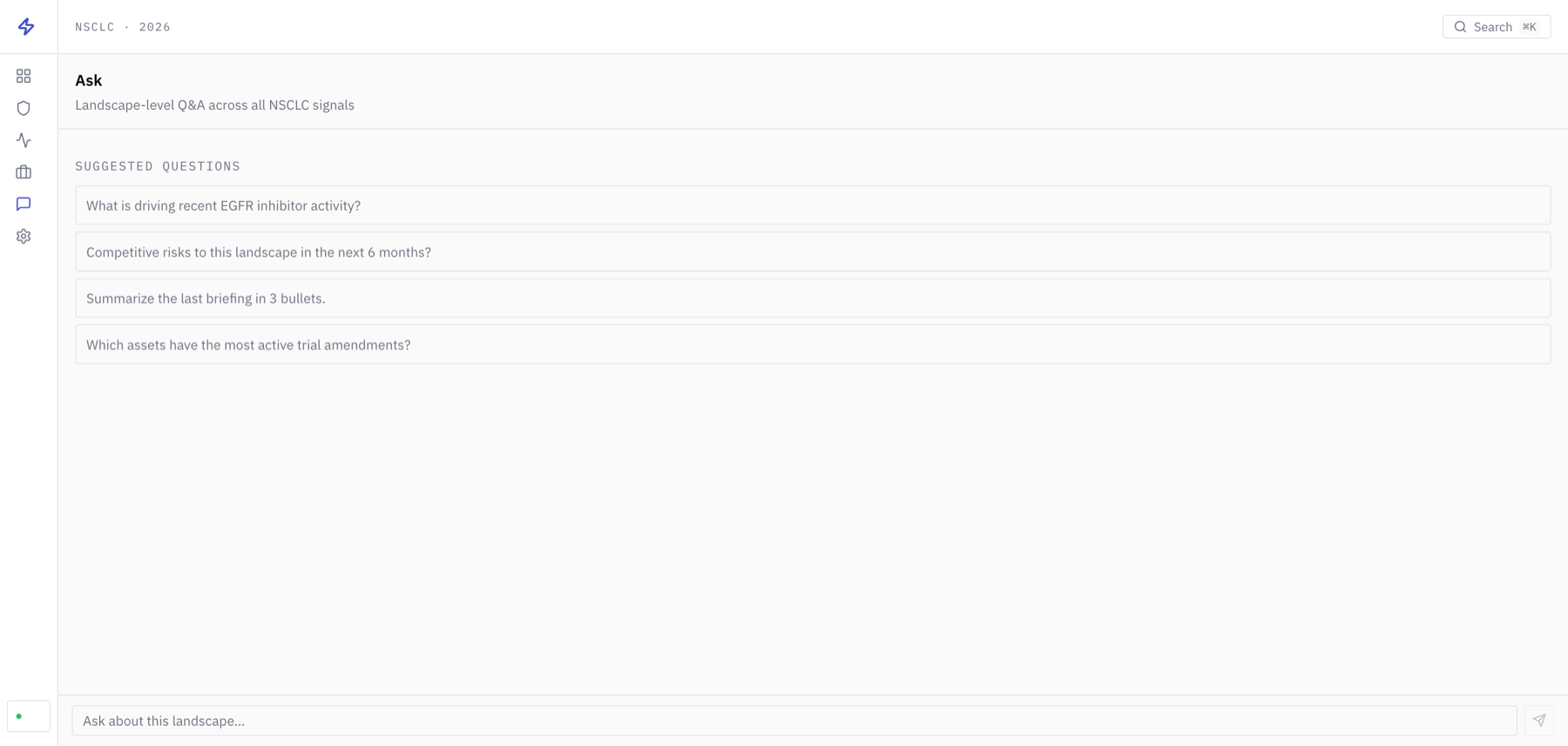
4. AI as a layer, not a tab
The original AI lived in a tab at the far end of the product, which made it feel like a feature rather than the point. I moved it on top of everything: ask a question in plain language from anywhere, get an answer cited back to the underlying signals. The aim was never an assistant for its own sake. It was getting someone to “so what” without opening ten tabs.
 beforeafter
Reflections
You design for experts by learning their world.
I spent the early weeks understanding how a CI analyst actually works, what a signal is, why provenance is non-negotiable. That moved me from drawing screens to shaping the product.
Legibility is hierarchy and provenance, not simplification.
The goal was never to hide complexity from experts. It was to order it, so the eye lands on what matters and can trace it back.
Shipping in code closed the loop.
Designing in the same stack the product runs on meant I handed over components engineers could use, and could check a hard layout in the browser instead of guessing in Figma.