Overview reader of signs
OGUR watches the open biomedical web around the clock and turns it into a live, source-anchored picture of the competitive field. When I joined there was a working engine and nothing to look at: no mark, no type, no color, no site. I built the brand from zero, the foundations the product runs on, and the marketing site that tells the story.
Details
Surface
Identity, design-system foundations, marketing website.
Role
Founding designer, solo. Brand and foundations.
With
Khalil Ouardini (founder & engineer).
Built in
Figma for the identity, React, TypeScript and Tailwind for the site and the live token system.
The starting point
The product had a sharp idea behind it: competitive intelligence is a surveillance problem, not a research one. Watch continuously, weight the weak signals, see what is coming before it is obvious. My job was to give that idea a face that read as calm authority instead of one more AI dashboard, and to make the whole thing feel like a single product, from the first marketing headline down to a severity dot in a table.
The direction
The name is the key. An augur is a reader of signs, someone who watches for what is about to happen. I built the world around that: quiet, patient observation, and the moment a hidden thing becomes visible.
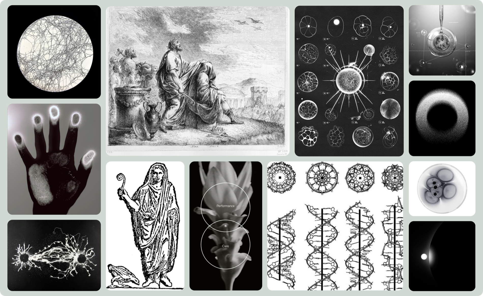
The references pulled from two places that turned out to be the same idea. Celestial: eclipses, crescent moons, a sky watched for omens. Biological: petri dishes, mycelial networks, dendritic growth, the field of medicine seen as something alive and unfolding. Both are about watching a system reveal itself. Under both ran the language of old scientific engraving, hands, eyes, instruments, which gave the brand its rigor and its respect for evidence.
The mark
A single ring, drawn in one gesture, not quite closed. It reads three ways on purpose: an eclipse, an aperture, and an eye. Something that watches, caught at the moment of revelation. It is hand-weighted rather than geometric, so it carries a little of the engraving world into an otherwise severe system. It holds as a standalone mark, in a horizontal lockup, and stacked, in light and dark.
Type
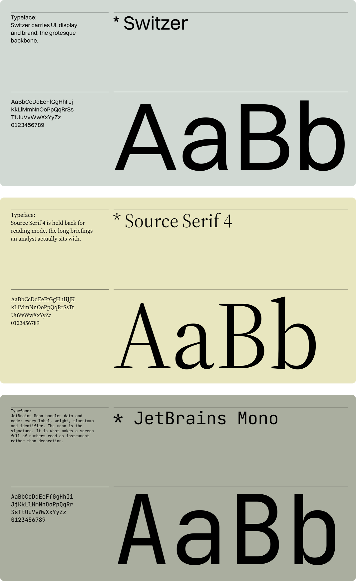
Three voices, each with one job. Switzer carries UI, display and brand, the grotesque backbone. Source Serif 4 is held back for reading mode, the long briefings an analyst actually sits with. JetBrains Mono handles data and code: every label, weight, timestamp and identifier. The mono is the signature. It is what makes a screen full of numbers read as instrument rather than decoration.
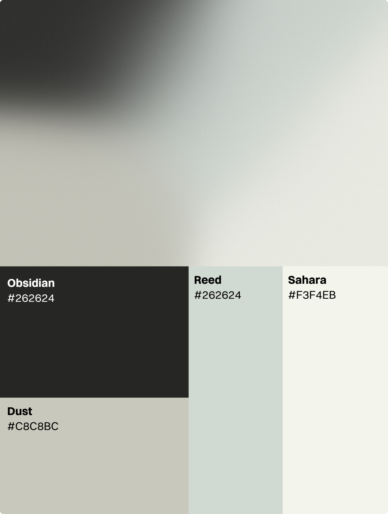
Color
This is where the system earns its keep. A warm-neutral grey foundation across thirteen stops keeps the product quiet, with color used as a language rather than a finish.
The palette splits in two on a strict rule. Some colors carry meaning and are reserved for it: Oxblood for high severity, Amber for medium, Saffron for low, Cellar for confirmation. They never appear anywhere they could be misread as a status. A second set, Iris, Teal, Rose, Slate, Mauve, plus the brand's Eclipse, is non-semantic, for franchise tags and other “this is a category” marks, where the hue means nothing on purpose. An analyst never has to wonder whether a color is telling them something. The naming carries the brand too: Eclipse, Oxblood, Cellar, atmosphere instead of hex.
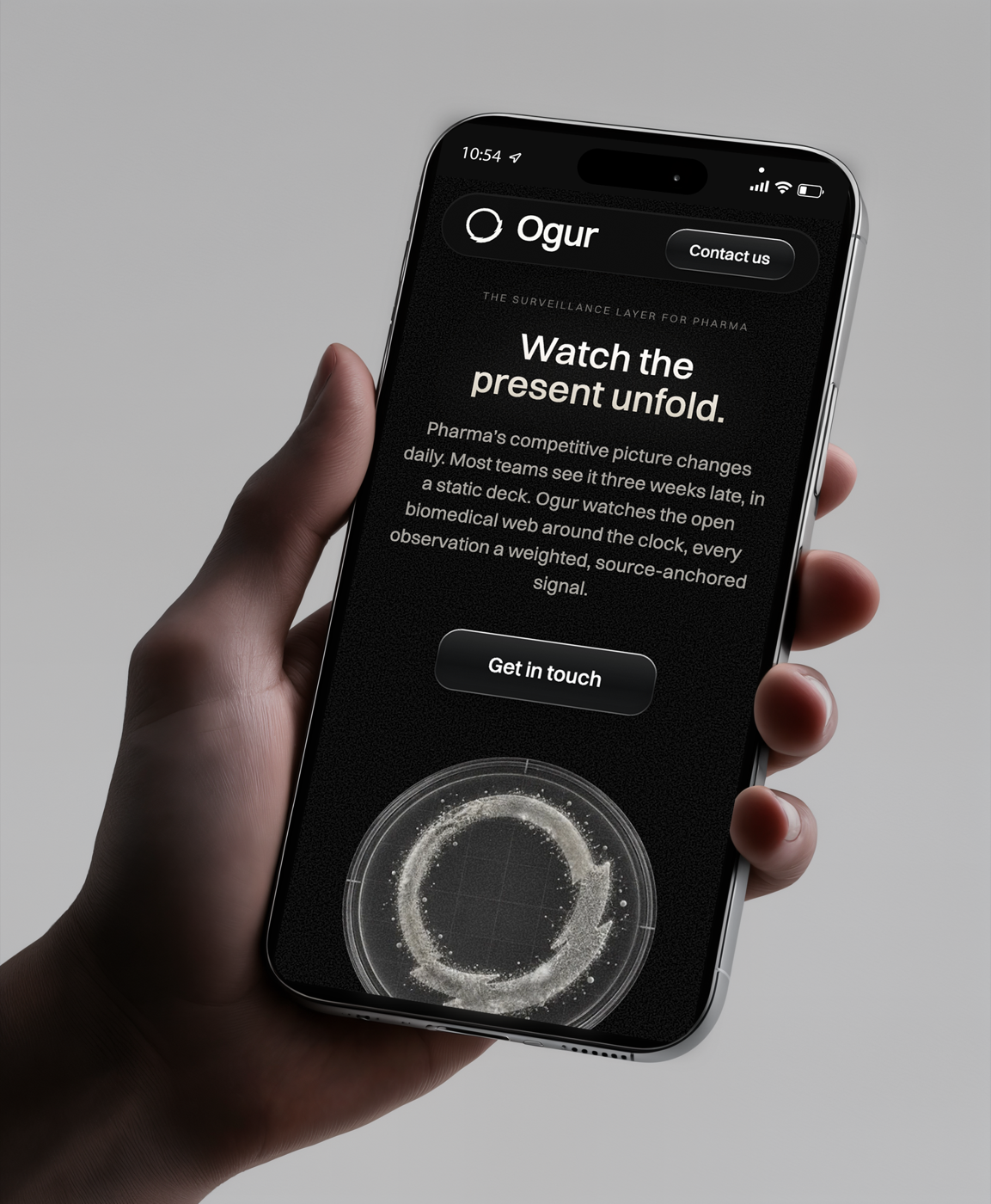
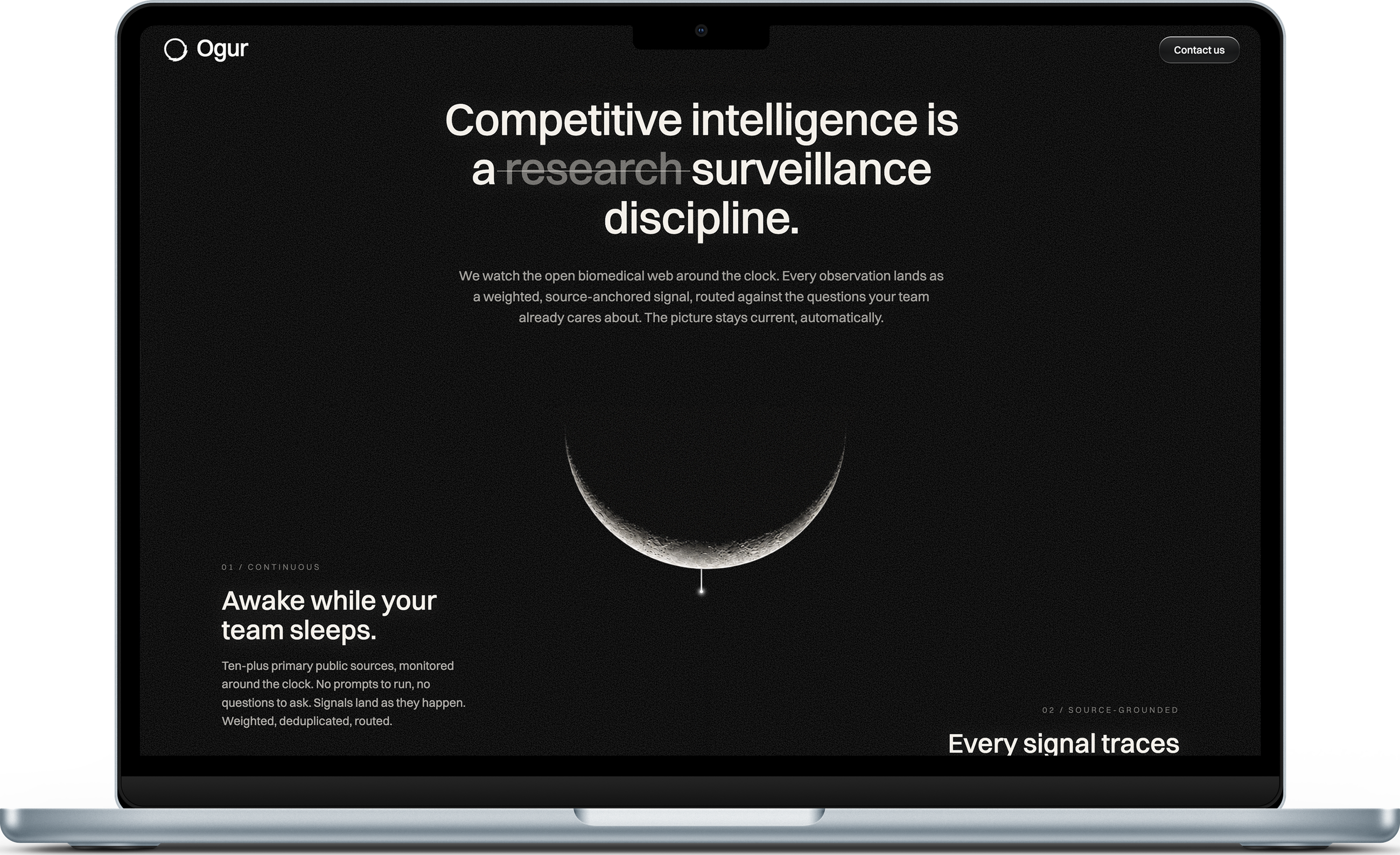
The website
I built the marketing site from nothing, in code. It is where the brand gets to be loud, the opposite register from the product. Near-black, film-grained, cinematic.
This is where the brand gets to be loud. The product is a work surface, so it stays quiet and out of the way. The site has the opposite job, to make the idea land before anyone reads a feature, so it goes dark, atmospheric, cinematic, and lets the imagery do the arguing. Underneath it is the same system as the product: same type, same color logic, same mark, turned all the way up. One identity, two registers. That it holds at both ends is the point.
How it holds together
The foundations are not a static file. They live as a rendered surface in the real stack, so a token is checked in the browser before any component is built on it. That is also how I work: I design the identity in Figma, then carry it into code myself, which keeps the brand honest all the way down to what the engineers ship.
Confirm termination
This removes Dupixent from your watchlist.
shadow-modal · destructive
Awaiting first analysis
Once Synthesis completes, your briefing appears here with cited evidence.