Overview Candosa
I joined Candosa just after a first designer had drawn the logo mark, then left. From there I built everything else: the illustration, the marketing, the site, and the visual brand as it matured across three markets. I also shaped the brand story underneath it, the archetype the whole thing grows from. This case study is about that maturation: how one identity grew from a bold company-formation tool in the UK into a warm, editorial, WhatsApp-native gestoría in Spain, without losing itself on the way.
Details
Role
Founding designer.
Brand, 3D illustration, marketing content, website.
Inherited
The logo mark and orange color. Everything else built from there.
Markets
UK, France, Spain.
2024–2026.
Tools
Figma, Photoshop, Illustrator, After Effects, Claude Code.
How I worked
I designed the identity in Figma, Illustrator and Photoshop, and built the marketing site in code, shipped to production, so the brand stayed exactly as drawn from concept to live page. My work evolved across three markets, each with different needs.
In three lines
Problem. Candosa entered three different markets in three years, each with a different user, language, and emotional starting point. The brand had to travel without resetting each time.
Approach. I treated the identity as a system that could mature, not a logo to repeat. Same DNA, the mark, the orange, the fox, the warmth, expressed with more range and more confidence at each step.
Result. A brand that went from functional and bold to editorial and human: a mascot that grew from a flat illustration into a 3D character, a serif voice, a refined palette with a dark mode, and a marketing system codified so a small team could keep it consistent.
The foundation, a caregiver brand
Candosa helps autónomos and small business owners handle their admin with a real accountant, mostly over WhatsApp. The promise is emotional before it is functional. Before the visuals, the brand needed a reason to feel the way it feels, so I shaped that foundation: the brand story and its archetype.
The archetype was not a mood-board decision, it was a reaction to the category. I looked at how the whole gestoría and admin-tool space talks to people, and it runs on one emotion: fear. Avoid the fine. The tax office can punish you. Don't get it wrong. The market sells anxiety, then sells itself as the cure.
That was the opening. Our users are already anxious, and the system genuinely is dense and punishing. Adding to the fear is easy, and everyone does it; removing it is the differentiated move. So Candosa is a caregiver, the archetype whose job is to protect and reassure, to take the fear out of something rather than add to it. The system is real and complicated, and we have your back.
Everything downstream comes from there. The fox, a clever, trustworthy friend who knows the system so you don't have to. Warmth over fear. A named person over a portal. Plain language over jargon. Every visual and copy decision after that has a single test: does it reduce the fear, or add to it? The archetype is what kept the brand coherent across three markets and a full visual overhaul. The expression changed at every step. The promise never did.
The arc
The spine of this work is time. The brand matured market by market.
2024 · UK, the starting kit
The first market needed an identity fast: a bold grotesque wordmark, a vivid orange with black and warm grey, and a flat illustrated fox as the friendly face of a bureaucratic process. It was clean, confident, and a little startup-generic. It did the job of launching , and it gave me the DNA to grow.
2024–2025 · France, the character and the system
In France I built the brand into a full product and marketing system, and gave the fox a role. Kit became a guide, the calm presence walking a founder through company formation, alive in the product and the marketing as a character rather than a decoration. The identity stayed bold and warm: orange, cream, flat illustration, a confident sans. This is where Candosa stopped being a logo and became a world.
2025–2026 · Spain, the maturation
Spain is where the brand grew up. The market was more crowded and the product more personal, a gestoría in your WhatsApp, so the brand needed more warmth and more polish. I introduced an editorial serif for display, paired with a clean sans, moving the whole brand from “startup” to “modern and trusted.” I rebuilt the fox in 3D so the mascot could hold a hero on its own. I refined the palette and added a dark mode, with restrained gradient accents on the marketing surfaces. And I built a new marketing site and a full social campaign around one idea: run your business without leaving the chat.
The mascot, Kit
The fox is the brand's emotional shortcut, the caregiver made into a character. A fox is clever and trustworthy, the friend who knows the system so you don't have to.
In the early markets it was a flat two-tone illustration: friendly, cheap to produce, and honestly a little generic. That was the right call for a fast launch. But by Spain the brand had a different job. The market was more crowded, the product more personal, a gestoría that lives in your WhatsApp, and a flat mascot started to read as “startup” at exactly the moment we needed to read as “trusted.”
So I rebuilt the fox in 3D. Same character, more presence. The point was not polish for its own sake: a rendered character can hold a hero on its own and feel like a companion rather than a logo, which is the register a caregiver brand needs when it is asking someone to trust it with their taxes. The trade-off was real. 3D is slower and more expensive to produce than flat, so I had to build a system around it, not just a hero shot, or the marketing team could not keep it alive week to week.
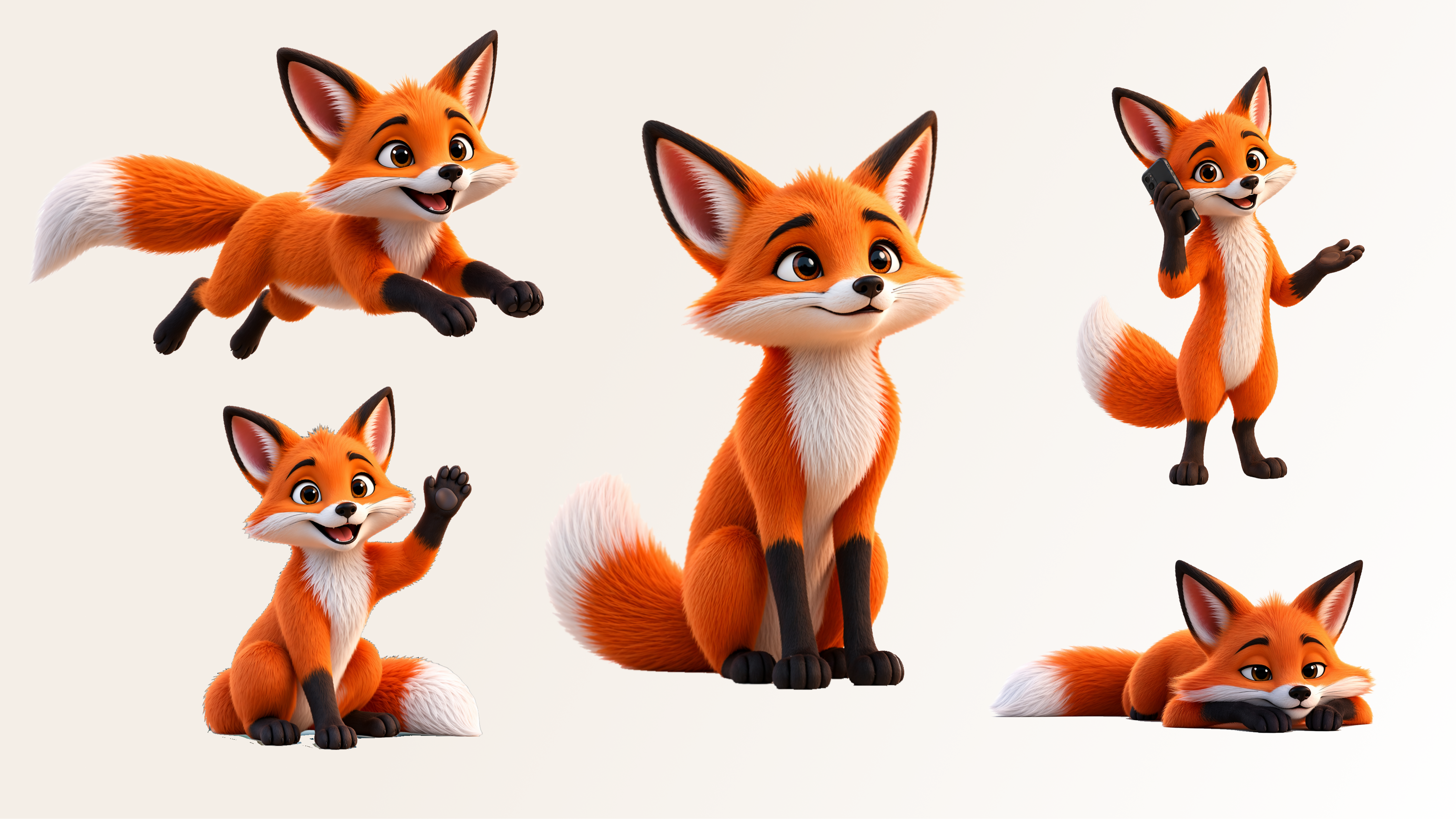
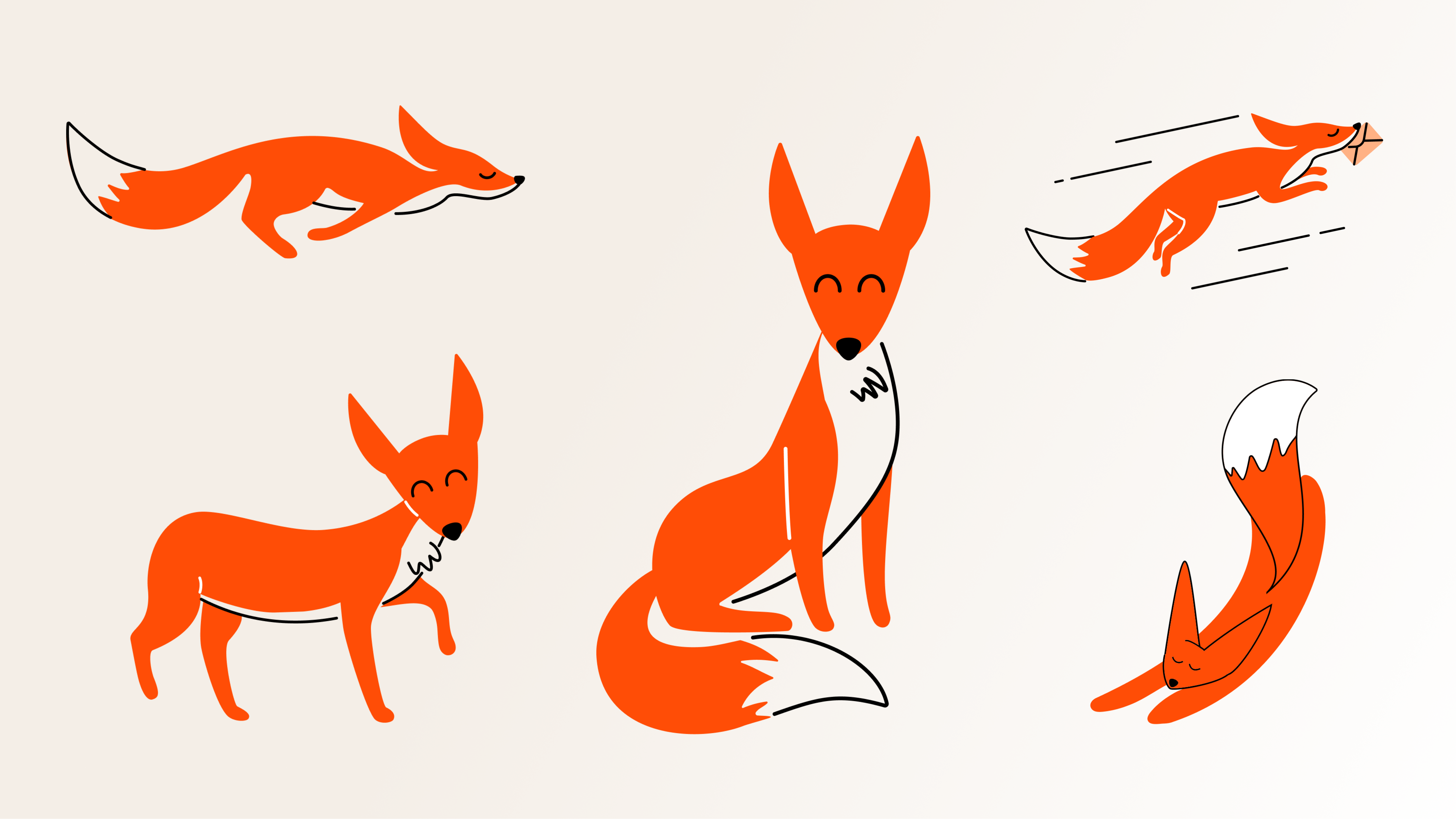 beforeafter
Designing for trust
By Spain, every brand decision was a trust decision. The editorial serif moved the brand from “app” to “an institution you would hand your paperwork to.” The 3D mascot turned a logo into a companion. The dark mode and restrained gradient accents signalled maturity without losing warmth.
None of these are decoration. Each one is a small argument that says this is a real, serious, human service, aimed at a user deciding whether to trust a stranger with their livelihood.
Voice
The day-to-day tone-of-voice guide is owned by the marketing team. It grows from the same foundation: warmth over fear, plain language, a real person behind every message, and a hard ban on the em dash. My contribution sits upstream of it, in the brand story and archetype the voice expresses, and in the visual world it lives in.
Closing
One promise, three expressions. The brand grew up market by market without ever changing what it was for.
The UK kit launched a company. France turned a logo into a world, with a character at its centre. Spain turned that world into something you would trust with your livelihood, an editorial serif, a rendered companion, a system the marketing team runs without me. Each step re-expressed the same caregiver promise with more craft. The expression changed every year. The promise never did.