Overview Service blueprint
I built Candosa's product foundations across three markets. The UK first, briefly. Then France and Spain, twice from close to zero, each in a different administrative and regulatory reality. As the founding designer, I designed a comprehensive service blueprint that acted as a 360° central engine for the entire company. It was the “master spec” that dictated three parallel products: the client app guiding the entrepreneur, the back office our agents use to manage cases, and a system of automated transactional emails. By architecting the logic first, I kept all three perfectly synchronized.
Details
role
Founding designer, end-to-end. Research, logic, and UI.
timeframe
6 months, 2025.
tools
Figma, FigJam.
category
Service design · Design system · UI/UX
Problem No shared logic
Launching Candosa in France meant digitalizing a notorious bureaucracy from scratch. French administration is synonymous with density, delays, and anxiety, and we had no existing documentation or flow for how to incorporate a company digitally. The mission was to take a process known for its friction and turn it into a moment of celebration.
I designed three products at once, client app, back office, and transactional emails, so the real problem was upstream: there was no shared logic to make them agree. Building screens first would have produced three tools that drifted apart.
Step 1, mapping the ecosystem
Before I designed anything, I learned the domain firsthand. A new market with no documentation meant the only way to design the system was to live the process. I registered a company through the manual route myself, to feel every step of friction and every wait. I interviewed accountants to understand the rigid legal logic behind the “happy path.” I went through the full flow of three competitors to see what worked before launch. Only then did I map the ecosystem and design the build.
The research
The “undercover” audit. I personally registered a company through the traditional manual process to feel every step, friction, and waiting time firsthand.
Expert analysis. I interviewed accountants to understand the rigid legal requirements behind the happy path.
Competitor analysis. I walked the full flow of three main competitors to spot patterns and borrow what works for launch.
From research to architecture
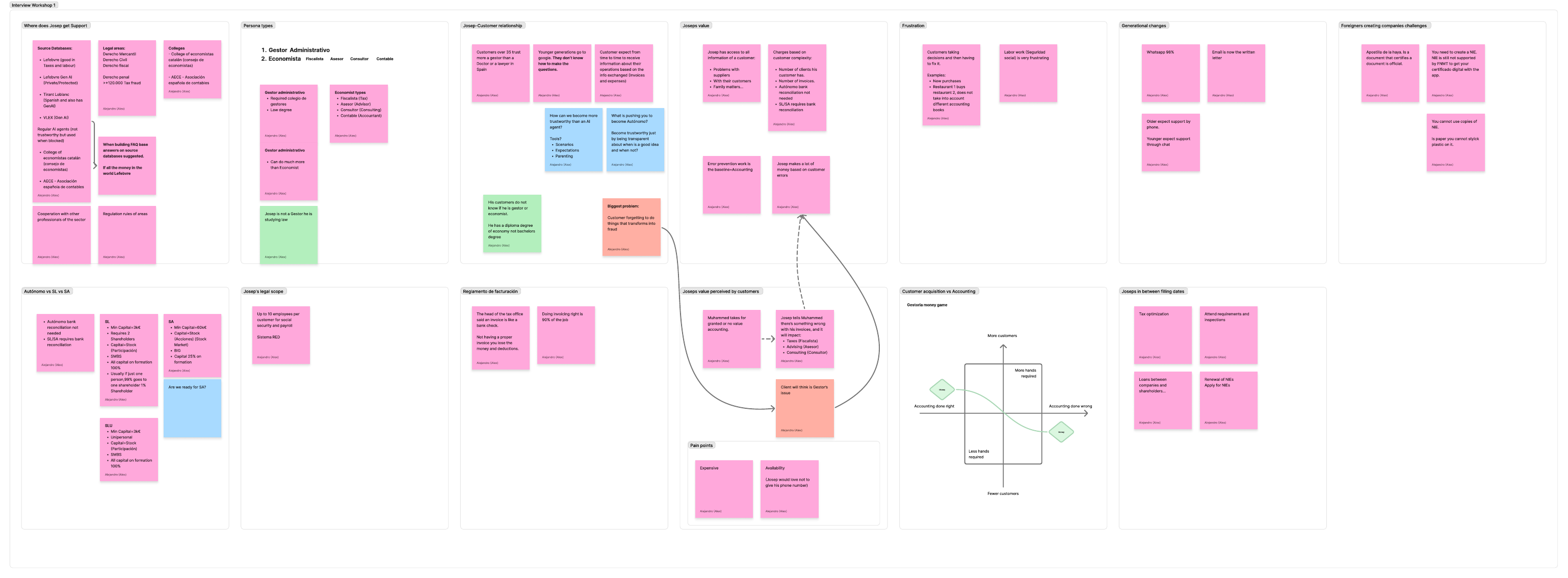
I synthesized these insights to map the standard administrative flow, then identified where to improve so our MVP stayed feasible to build while still feeling fast and stress-free. That became the master blueprint, a source of truth for the whole team, covering every layer: the customer system, the agent system, automated communications, and the unhappy paths. I shipped it with full documentation explaining the rationale and business choices behind each step.
Key logic I implemented
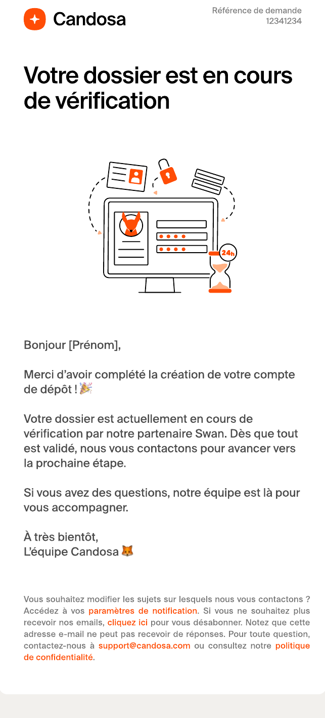
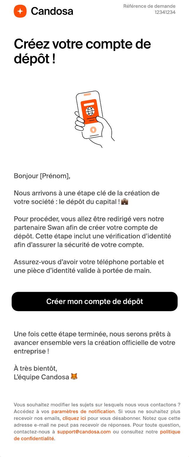
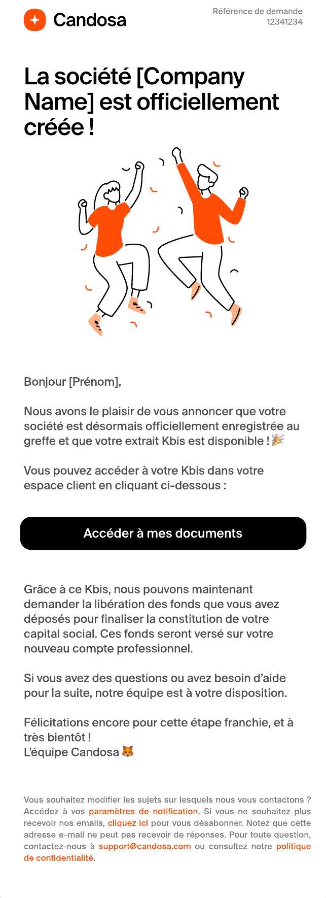
The “order status” protocol. Devs, ops, and design were speaking different languages, so I established a standardized order-status system to force alignment, everyone agrees on what, say, FR_ORDER_PROCESSING means.
- 01
Waiting
The user acts.
- 02
Processing
The agent reviews.
- 03
Validated
The system unlocks the next step.
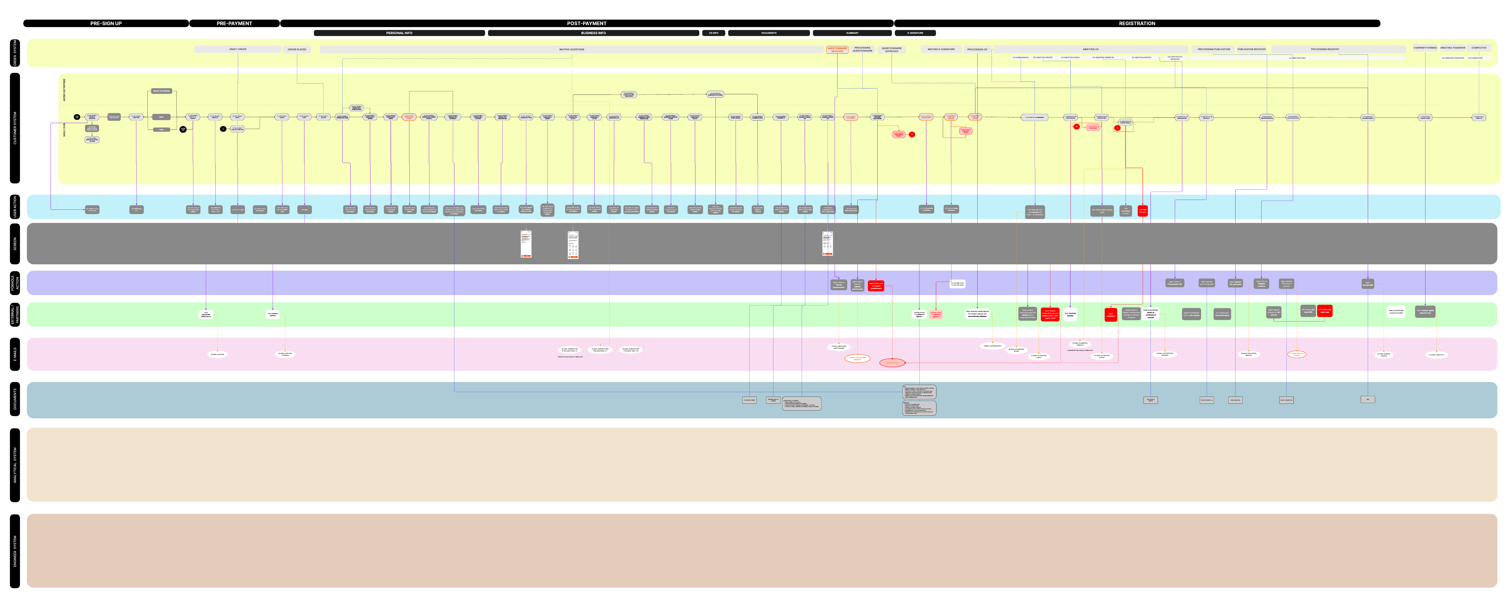
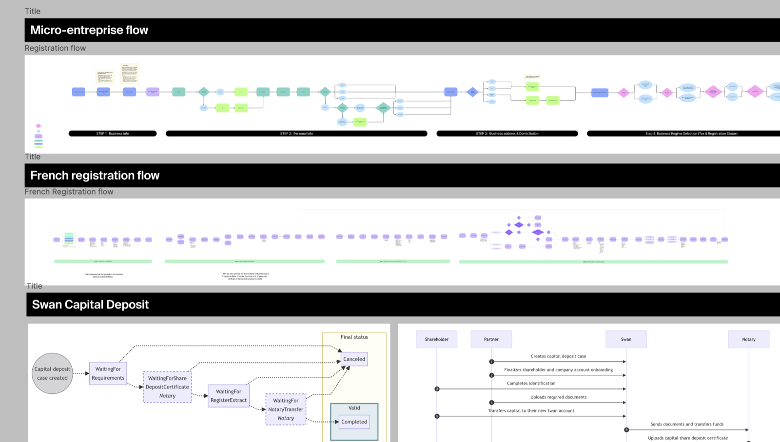
Step 2, the 360° execution
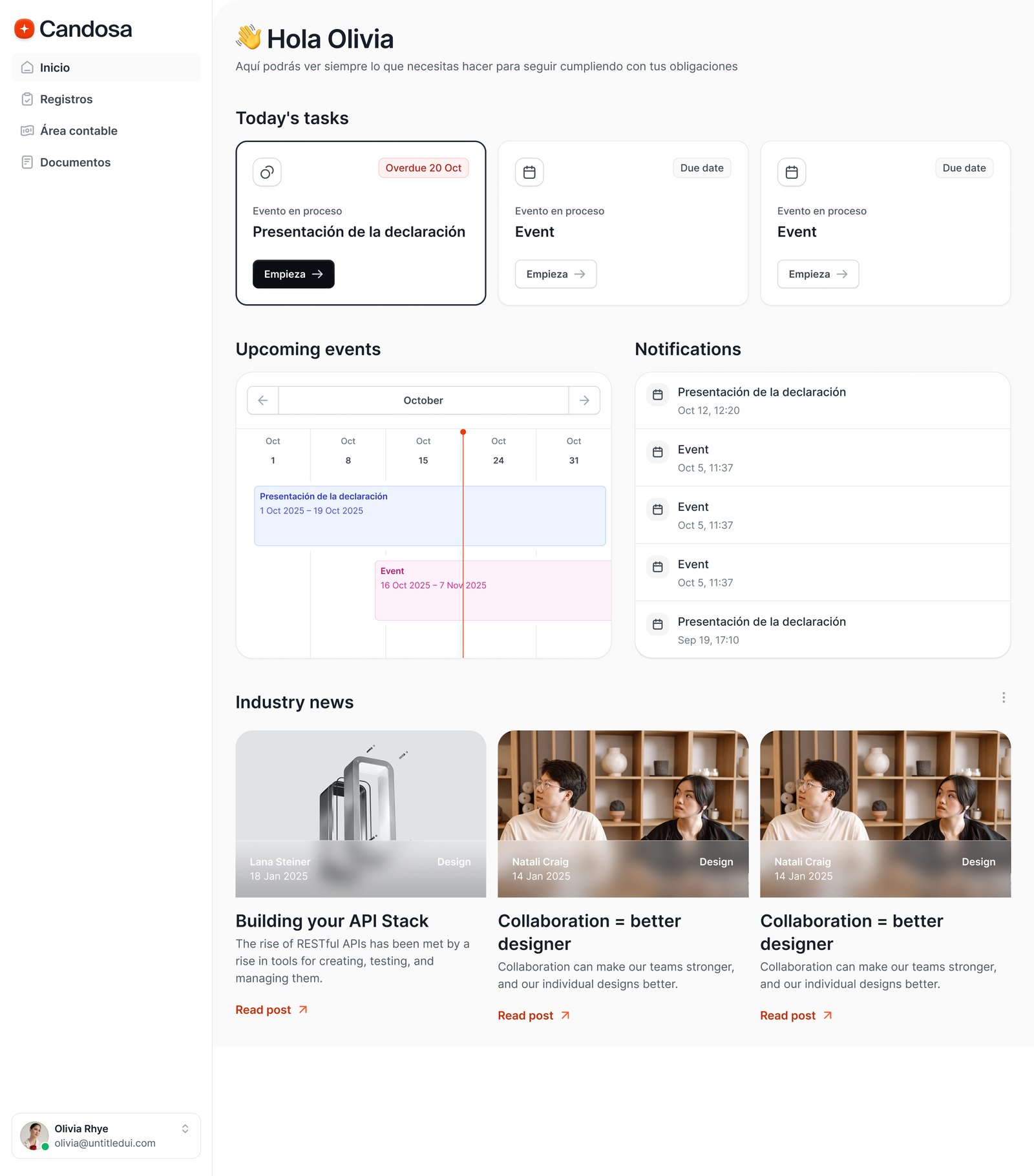
With the logic locked, I moved to visual design, my first major initiative as founding designer, setting the foundations for the whole company. The goal was a mirrored ecosystem where the client app, the back office, and the emails feel like one continuous experience.
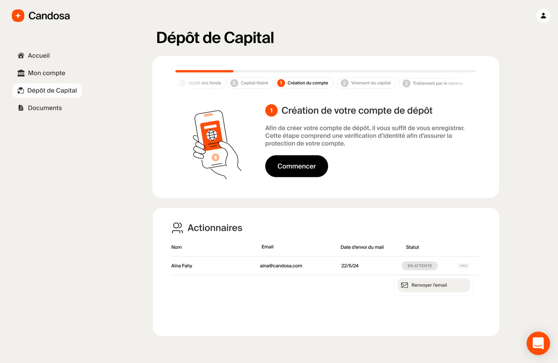
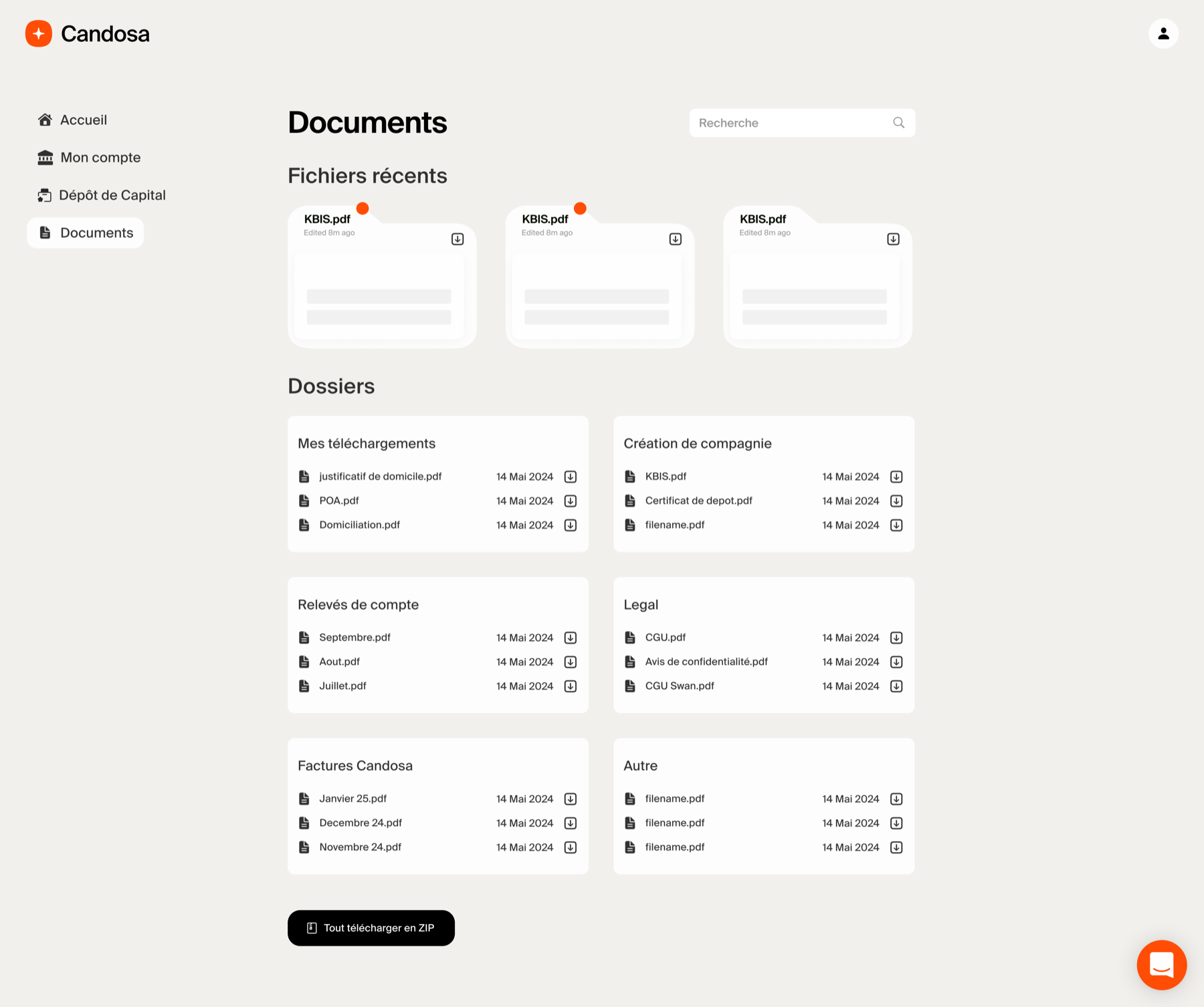
1. The client app, hiding the complexity
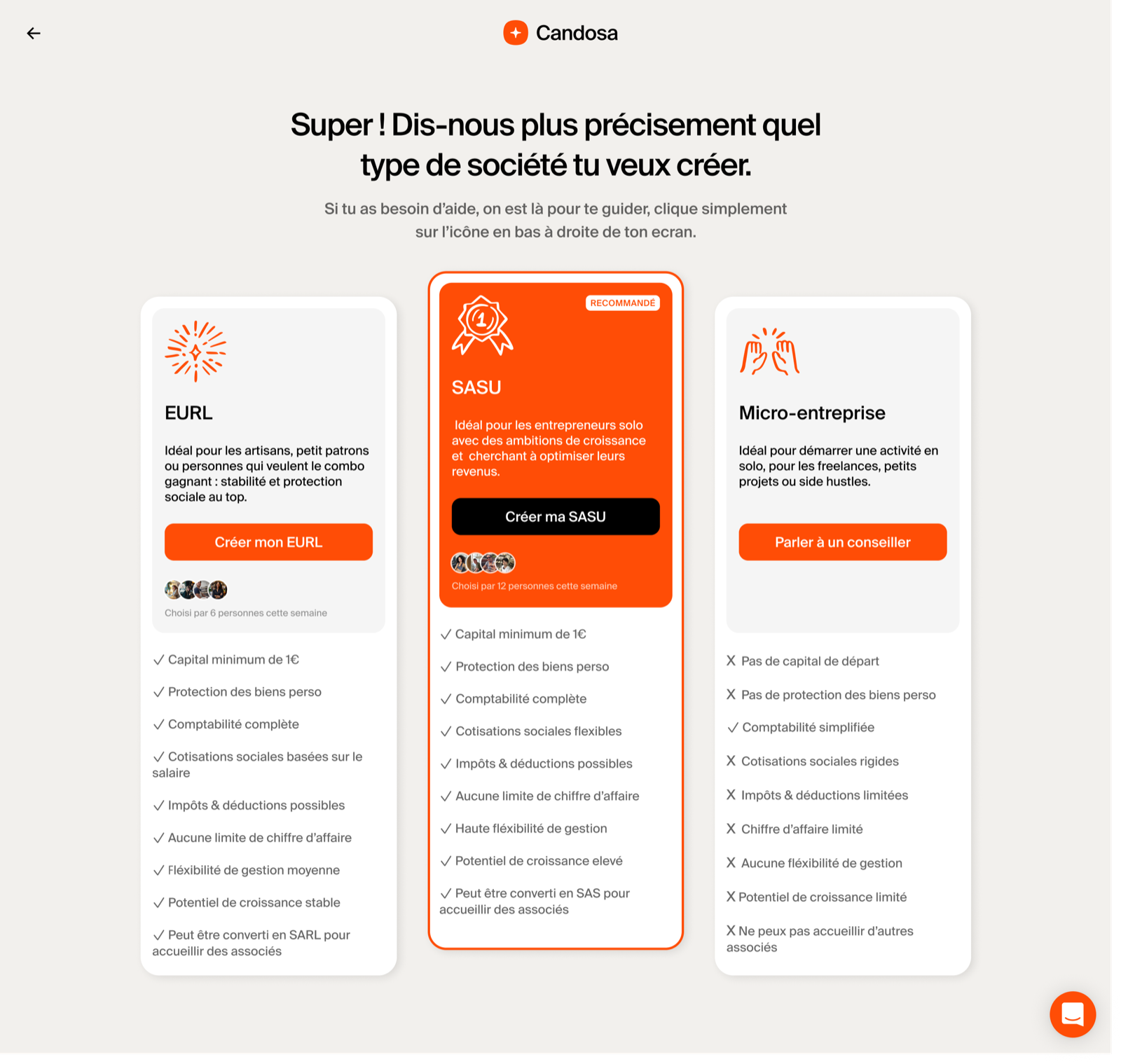
French administration requires 20+ data points, but I didn't want to overwhelm the user. The goal was to hide the complexity I found during research and offer a reassuring, step-by-step hand-holding experience through the anxiety of incorporation. For complex legal decisions, like choosing between SASU and EURL, I designed comparison cards highlighting the key differences (tax, status) so users decide without leaving the flow.
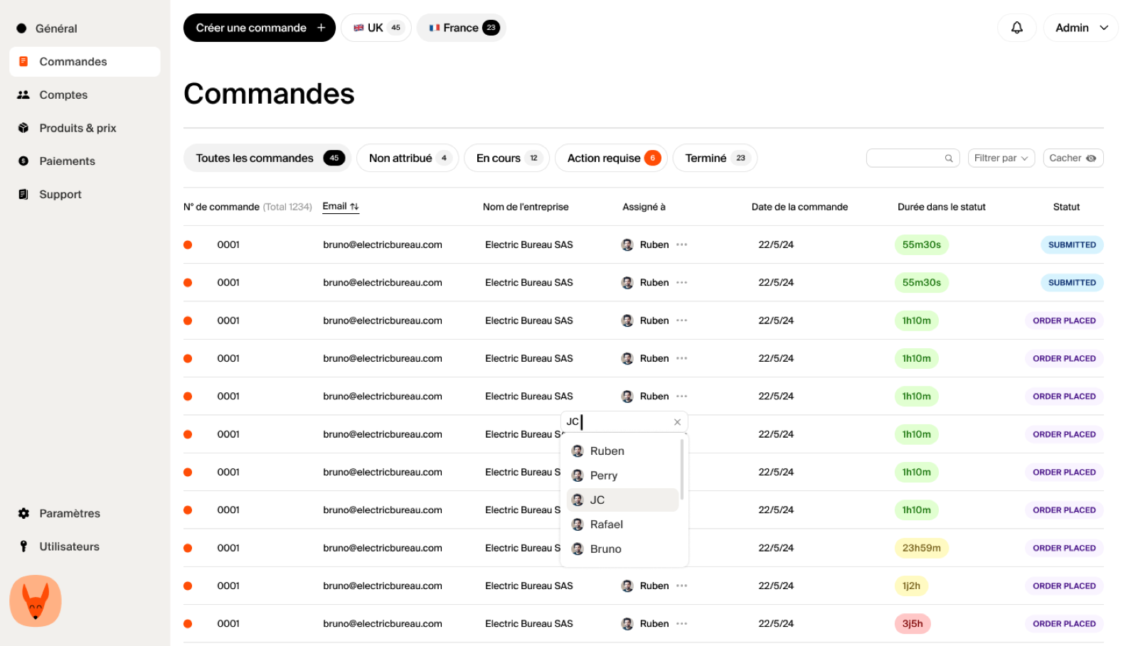
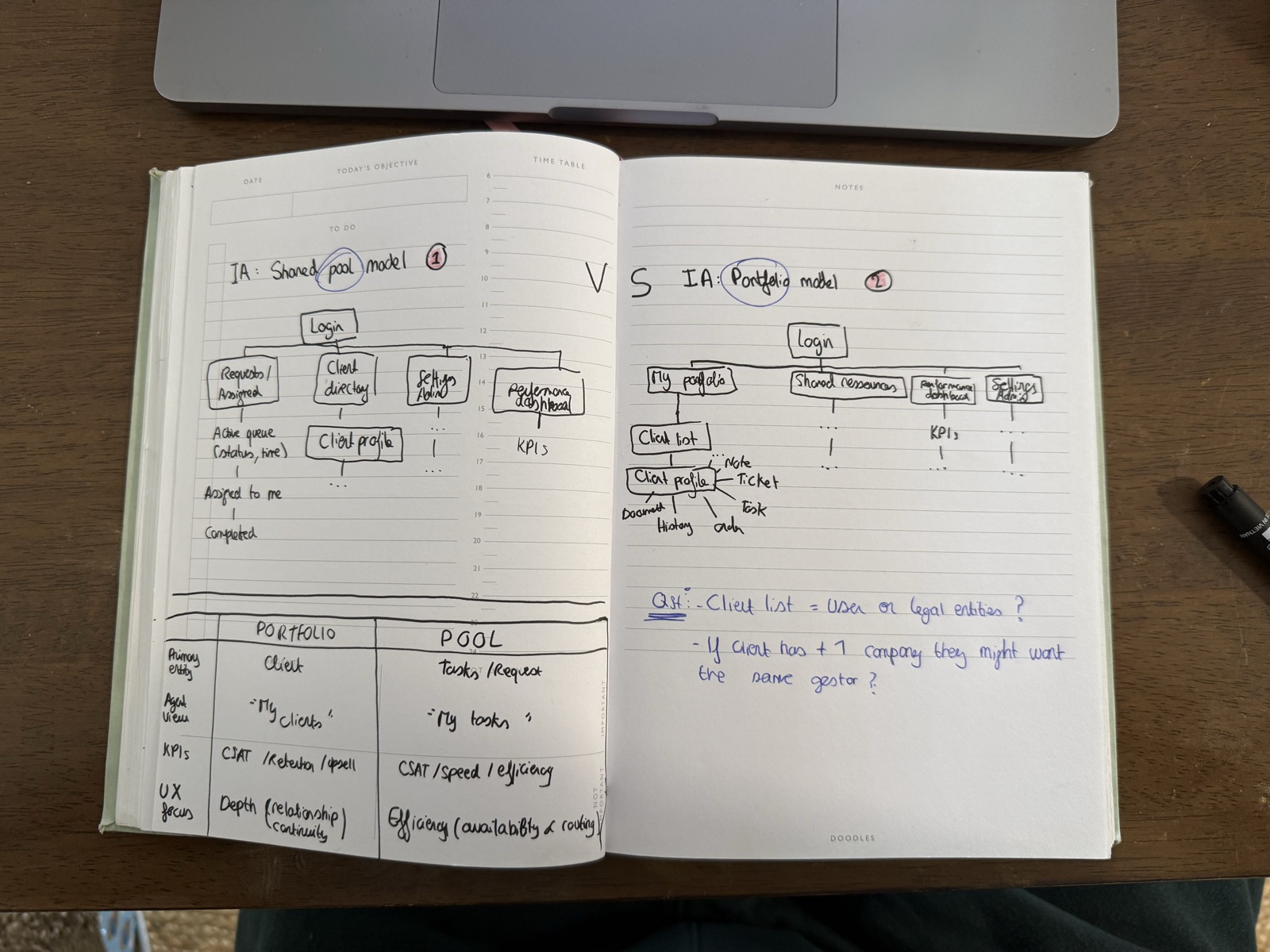
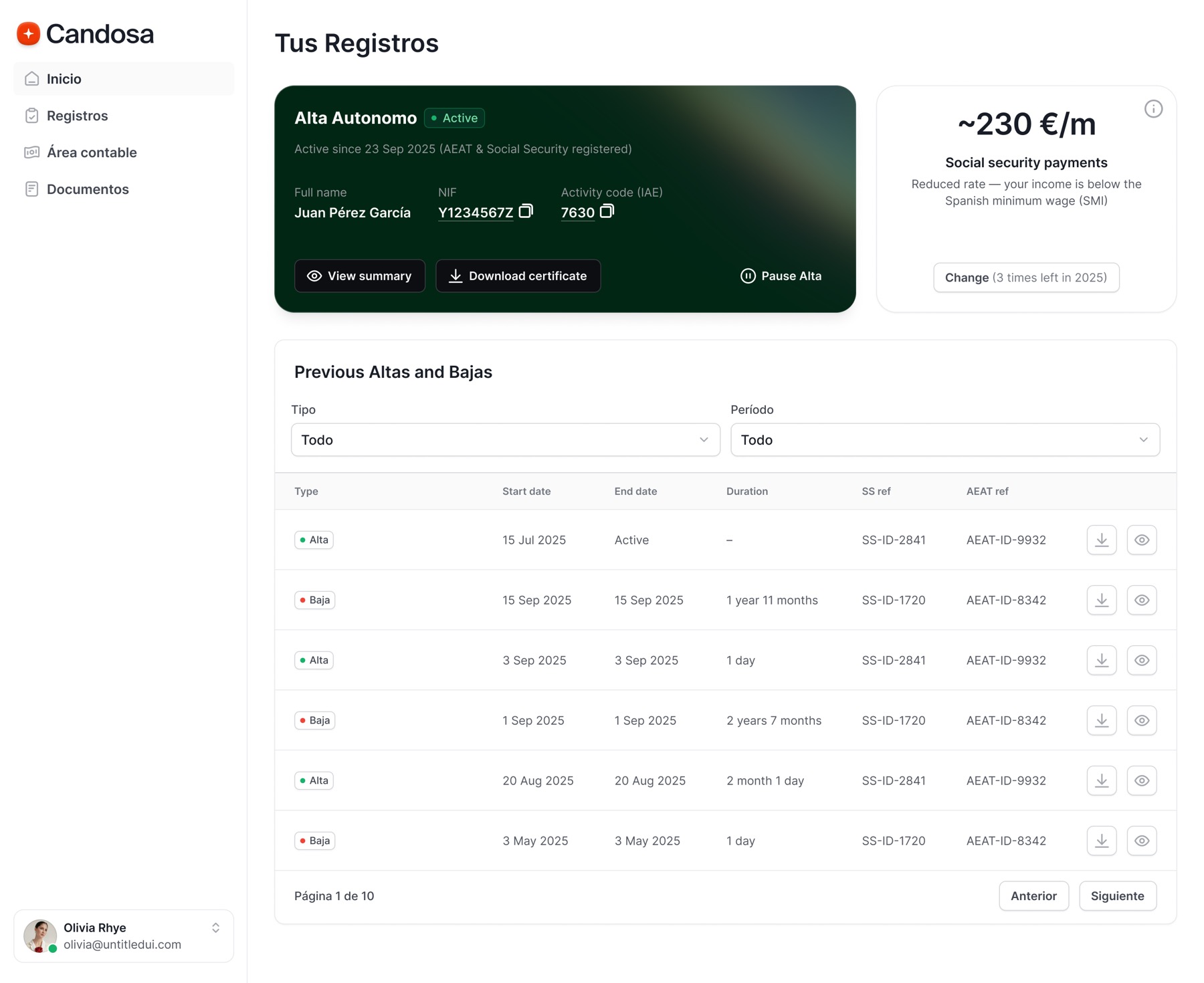
2. The “foxhole” (back office), built for speed
The internal tool is the operational twin of the client app.
Data symmetry:the interface mirrors the user's journey step by step, if the user is at the capital-deposit stage, the agent sees the exact corresponding validation block.
Action-oriented UI: unlike the spacious client UI, the admin view is dense and utilitarian, giving agents every useful detail at any point so they can validate the process states we defined in the blueprint.
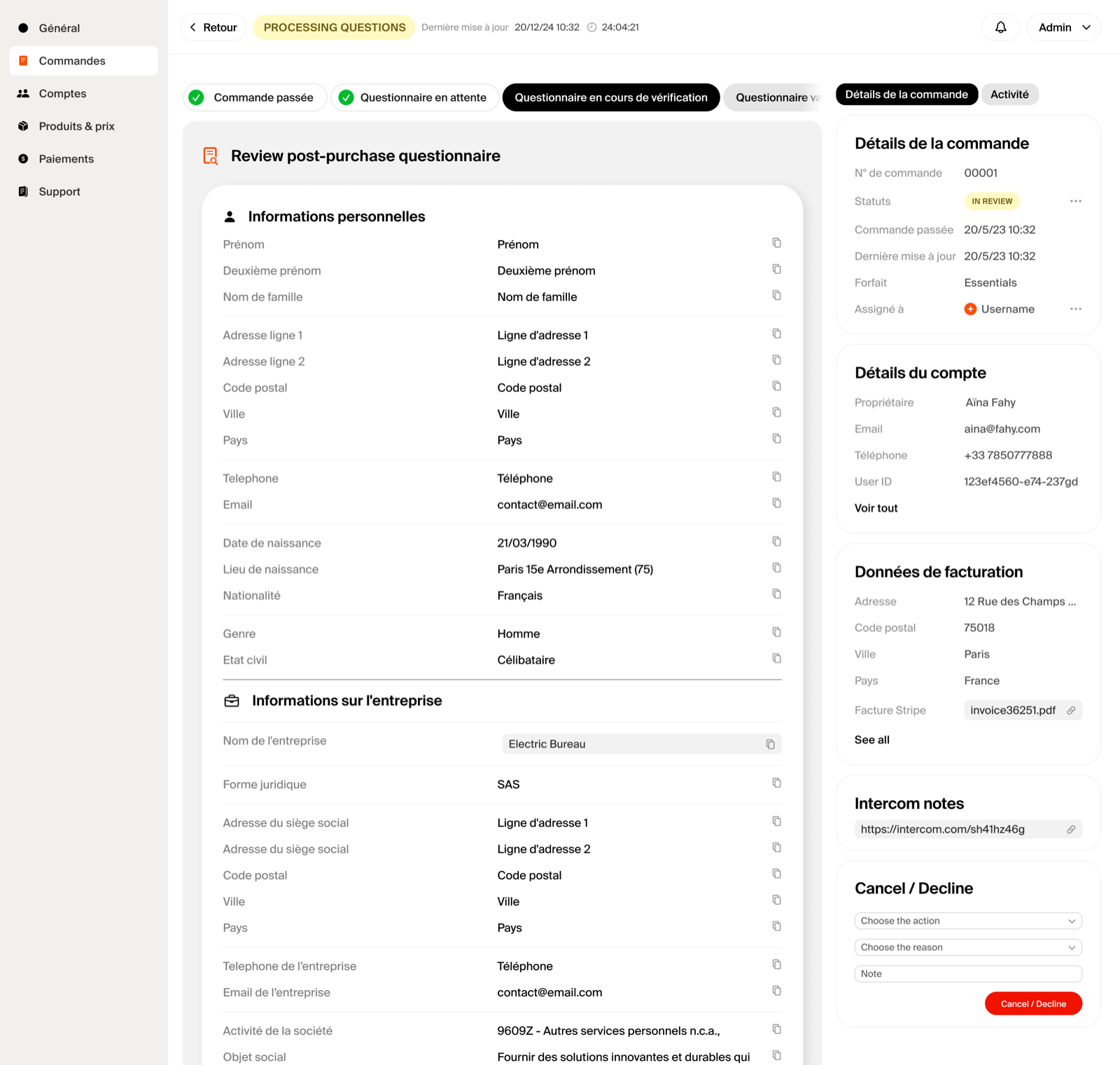
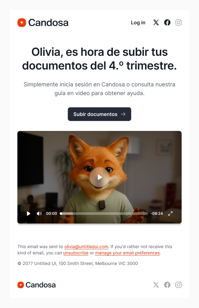
3. The communication layer, the invisible interface
The system doesn't stop at the screen. I designed automated transactional emails to act as the glue between the user and the platform.
Status-triggered: using the order-status protocol, every major status change fires a specific template. The welcome email isn't just a greeting, it's a functional confirmation that the user's data successfully entered our FR_ORDER_DRAFT state.
Impact
This went beyond a launch, it defined how the whole company organized around a common process. By investing in the architecture before the pixels, we achieved:
Engineering velocity. The blueprint and documentation became the bible for the tech team, drastically reducing scope creep and clarification meetings during the build.
Operational efficiency. Agents needed little training to understand the user flow, the back office was intuitive because it mirrored the client journey exactly.
Act II, Spain, the second 0 to 1
Spain looked like a copy-paste from the outside. It was not. A different tax system, a different legal structure, and a different central user: the gestor, the licensed accountant who does the work. The French blueprint gave me a method, not an answer. I had to run the whole discovery again, deeper this time.
A week inside the work
I spent a full week embedded with a gestor, watching every process end to end: how filings actually happen, where the real bottlenecks sit, what the software they already use does and fails to do. You cannot design a back office for a job you have only read about, so I went and watched the job.
From observation to model
I ran user interviews with gestores, then turned what I learned into domain models and service maps: the entities, the states, the handoffs the Spanish reality runs on. This is the part that never shows up in a screenshot but decides whether the product is right. Get the model wrong and every screen inherits the mistake.
Then I rebuilt
With the model in hand I rebuilt the back office and the client app for Spain, close to from scratch. Same philosophy as France, hide the complexity, keep one source of truth across channels, but shaped around a different user and a different system. The brand matured at the same time: a warmer, more modern direction with the fox in 3D and a new site, covered in its own case study.
The insight. A blueprint is a method you can carry between markets, not a template you can paste. What transferred was the discipline, mapping the whole ecosystem before touching a screen. What had to be rebuilt was almost everything else.
This project was never one build. It took three. The founding operating system for Candosa, rebuilt from close to zero in each new market, across three different administrative realities, on one method.
France proved the approach, a master blueprint and an order-status protocol that let a lean team onboard its first hundreds of entrepreneurs. Spain proved it travels, after a full second round of research, domain modeling and rebuild. Designing the logic before the pixels is what let the same small team take on the most notorious bureaucracy in Europe, and then do it again in a new country.