Overview Candosa AI
Candosa helps founders incorporate a company in Spain and France. One screen, choosing the legal activity code that classifies your business, was quietly breaking the funnel. I led the redesign that turned a rigid government form into a conversation with an AI, recovering the conversion it was bleeding and freeing the ops team from correcting every file by hand.
Details
role
Founding designer, lead. Product, UX, and the AI flow.
timeframe
3 months, 2025.
tools
Figma, Lovable, Gemini.
category
Product · Conversational AI · UI/UX
team
Pedro Mejuto, SVP Product
Diagoras Nicolaides, Principal Software Engineer
Problem Government syntax
When entrepreneurs incorporate a company in Spain and France, they must select a specific activity code. These codes are rigid, legalistic, and confusing. Our users know what they do (“I drive an Uber”), but they don't know how to translate that into government syntax.
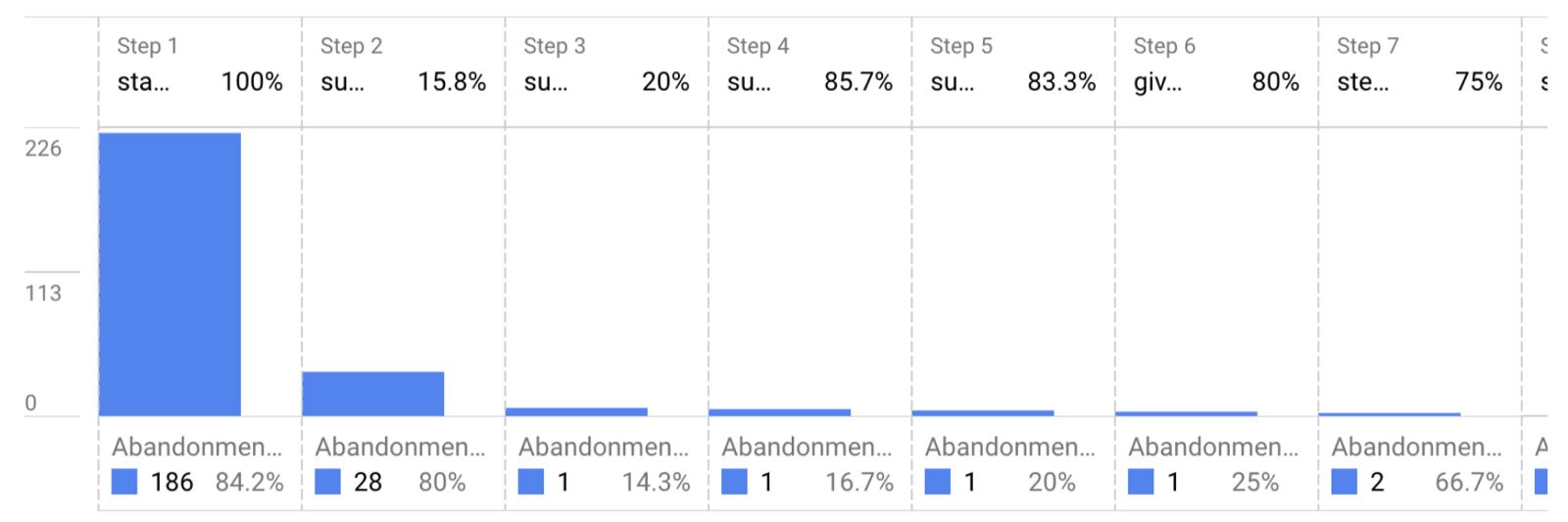
The user pain
We saw an 80% drop-off at this step in the registration flow. Even more critical, the step happens just before payment, it was the single biggest barrier to conversion.
The business cost
Because users provided vague descriptions, our internal operations team had to manually review and correct 100% of files, creating a massive bottleneck in the company-creation process. This one screen was behind more than half of our support contacts.
Impact
Approach
We didn't arrive at the AI solution immediately. I led the team through three distinct iterations to understand how people actually behave on this step.
Phase 1, the “open-ended” approach (France)
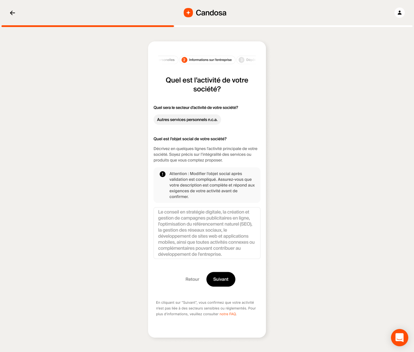
Initially we assumed users just needed a push. We used open text fields with automatic templates and strict character limits to force detailed descriptions. We also struggled to fit everything on screen, disclaimer, FAQ, description, text field, and to define a prioritization that kept the step digestible. The insight:high friction doesn't yield high quality. Users felt overwhelmed by the blank canvas and pasted generic text just to clear validation.
Phase 2, the “taxonomy” method (France)
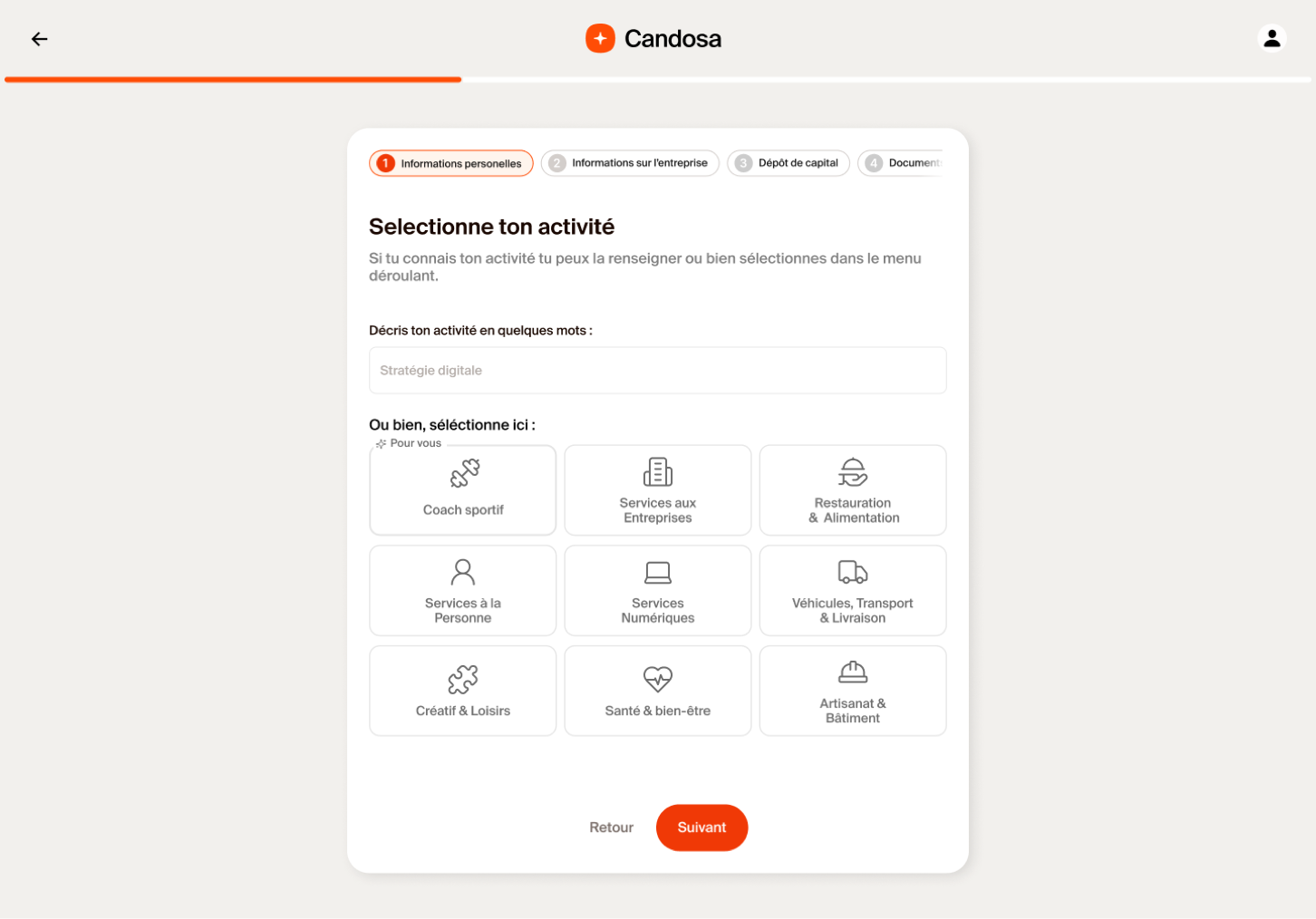
To reduce writing, we introduced a visual category selector, structuring the data into categories and sub-categories with icons to make it digestible. The insight:while visually cleaner, this introduced decision paralysis. Users couldn't fit their unique jobs into generic buckets (is a personal trainer “Health” or “Services”?), leading to misclassification, and to people picking “Other” just to skip the step, putting us back where we started.
Phase 3, the conversational pivot
To launch in Spain, we pivoted from a form-based model to a conversation-based model. The problem was never the UI components, it was the cognitive load. The fix was to remove the burden of choice entirely. The insight: users don't know the legal code, but they know how to describe their day-to-day work.
- 01
Natural input
The user speaks plainly, “I want to be a VTC driver.”
- 02
Contextual loops
If the input is vague, the system doesn’t guess. It triggers a clarification flow to ask for specifics.
- 03
Smart suggestion
The AI maps the intent to the exact legal code, which the user simply confirms.
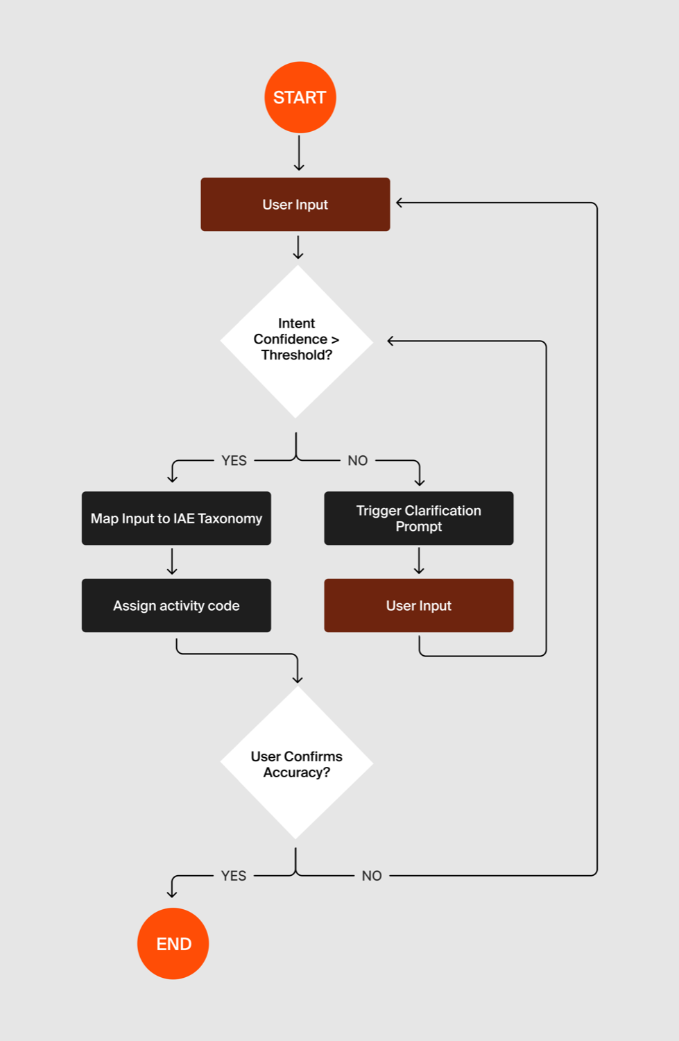
Designing for AI meant mapping confidence thresholds rather than linear paths, flows where the system acts as a guide, asking when unsure and confirming when confident.
The solution, Candosa AI
The final design prioritizes trust. We used a chat interface because it's a familiar pattern for “asking for help.” By letting users verify the AI's suggestion rather than generate the data themselves, we turned the most intimidating step of incorporation into a magical moment, proving that complex bureaucracy can feel simple with the right abstraction layer.